AI & JOBS

Will adoption of Artificial Intelligence (AI) prove to be a job killer or enhancer? This blog post addresses this question from three perspectives:

  • How the U.S. job base has adapted in the past to changes in technology, cultural and economic environment — an empirical exercise drawing on the experience of historically observed shifts away from agricultural and then manufacturing employment.

  • What these changes suggest for how employment in the future may occur with AI adaptation across a seemingly never ending realms of human endeavor — a more speculative undertaking albeit drawing on informed opinions of recognized research organizations.

  • How the U.S. might adapt to AI changing employment prospects in as-needed stair-step fashion — reflecting factors favoring full employment rather than net job displacement.

This overview analysis indicates that prior year transitions from agriculture and then from manufacturing resulted in their respective shares of U.S. employment dropping by about 3-5% points per decade. If this experience is applied to AI, it would suggest a pace of change that could be absorbed by offsetting job growth in tech-focused sectors of the economy.

If the pace of AI-driven change occurs more rapidly as some sources suggest, net results could be more de-stabilizing for American workers. Advance preparation for potential business, worker and regulatory mitigation should be considered sooner rather than later so that effective measures can be ready to go before the prospective negatives overwhelm market and/or regulatory capacities to effectively respond.

U.S. Economic Adaptation

Let’s begin by reviewing the fundamental changes that have occurred with employment in the U.S. over the last 150 years. In that period, the country has gone from agrarian to industrial to post-industrial.

Based on employment data available, the analysis is divided between two time periods:

  • 1870-1930 - from post Civil War reconstruction to a 1st world war and to onset of the Great Depression.

  • 1940-2020 — from economic recovery to a 2nd world war and to emergence of a baby boomer dominated culture.

1870-1930

As depicted by the following graph, the U.S. economy took off on a tear post-Civil War, increasing from what the U.S. Census Bureau defined as just under 13 million gainfully employed Americans in 1870 to approximately 49 million in 1930. This is close to a 4-fold increase and equates to an average 2.2% per year job growth rate.

Sources: U.S. Census Bureau. Comparative Occupation Statistics: 1870-1830 (Part II).
As defined by the Census Bureau, total “gainful employment“ includes workers age 10 and above.

The number of gainfully employed workers went from less than 34% of nationwide population in 1870 to nearly 40% by 1930. Labor force participation was augmented by an increasing presence of women in the workforce as well as child labor.

Children ages 10-15 accounted for 1.75 million workers as of a 1900 peak — equating to about 6% of all U.S. employees. Women went from 15% of the employed workforce in 1870 to 22% by 2030.

From an occupational perspective, America was still a largely agrarian society in 1870 with agricultural workers accounting for over half (53%) of all jobs. As depicted by the following graph, 60 years later agriculture’s share of the gainfully employed was cut by more than half — to much reduced 21% share. This was due to introduction of labor saving innovations ranging from rural electrification to replacement of horses by petrol-powered farm equipment.

Source: U.S. Census Bureau.

Averaged over this 60 year time frame as a share of total employment, ag-related jobs dropped by just over 5 percentage points per decade. With agriculture employment less dominant, employment growth shifted to other sectors of the U.S. economy.

Manufacturing went from 20% of U.S. employment in 1870 to 30% in 1920, then dropping somewhat to 29% in the depression year of 1930. Full uptake of the industrial revolution spread to other sectors of the economy — increasing from 27% of all jobs in 1870 to just under 50% in 1930. Major beneficiaries of this more diversified upsurge included transportation, trade, professional services plus what the Census termed as clerical occupations.

1940-2020

This period is bookended by a second world war at its outset, followed by steady economic growth (albeit also with cultural upheaval) and then more volatile years economically with entry into the 21st century. As illustrated by the following graph, U.S. non-farm employment increased from 32 million in 1940 to 142 million as of 2020 — a more than 4-fold increase over 8 decades.

Source: U.S. Bureau of Labor Statistics (BLS), Current Employment Statistics (CES) survey.
Note: BLS data sets use different definitions for the 1940-2020 period than for the earlier 1870-1930 Census Bureau data set and so are not directly comparable. CES data for the 1940-2020 time frame excludes farm employment. Separate BLS Quarterly Census of Employment and Wages (QCEW) data includes agriculture which as of 2022 now accounts for less than 1% of QCEW employment nationwide.

Even more importantly, the 8-decade period from World War II also marks the transition of a wartime and manufacturing led economy to a yet more diversified and service-focused job mix. The rate of job growth averaged 1.9% per year over this longer time period. This is somewhat below the 2.2% annual growth rate previously experienced as the nation was industrializing in part due to significant in-migration experienced from from 1870-1930 — albeit partially offset by increasing post-depression labor force participation over much of this most recent 80-year period.

Employment increased from 25% of population in 1940 to a peak of 47% in 2000, then dropped back over the next two decades to 43% as of 2020. As illustrated above, overall job growth also has stagnated over these past two most recent decades than previously from 1940-2000.

The post WWII era has not been kind to U.S. manufacturing — at least in terms of job share (as depicted by the graph below).

Manufacturing’s share of non-farm employment is now less than one third its share of employed workforce than in 1940 and 1950. From 31% of all jobs in 1940/50, manufacturing appears to have bottomed out a 9% share as of 2010/20 — equating to an average 3-4% point per decade drop in its share of non-farm jobs — but more stabilized this last decade from 2010-20. Uncertain is whether the current emphasis on re-shoring and shortened supply chains will prove to stem further domestic manufacturing employment erosion going forward.

A grouping of key service sectors stepped in to fill the void left by manufacturing’s reduced job share. Led by health care and professional services, all together these growth-oriented services have gone from 40% of non-farm employment in 1940/50 to peak out at 67-68% as of 2010/20. Other components of growth-oriented services include information, financial activities, leisure/hospitality and government.

All other sectors have stagnated in terms of job share, together declining from 29% to 24% of domestic employment over the 80 years from 1940-2020. These other slower growing sectors include natural resource extraction, construction, wholesale and retail trade, and transportation together with warehousing and utilities.

Reconciling AI to Employment

With this historical background in hand, we now switch to the more futuristic consideration of potential AI impacts on U.S. (and global) employment in the decades ahead.

AI Categories

Two primary categories of AI are on the table as being utilized or considered currently and in the years immediately ahead:

  • Narrow AI (ANI) — as the most common form of AI currently, used for highly specialized systems designed and trained for specific task(s). Applications range from speech recognition to health diagnostics to autonomous driving.

  • Artificial General Intelligence (AGI) — currently a theoretical and not yet proven concept but a longer term goal of AI research covering any intellectual task that a human can perform.

A potential as yet more distant and hypothetical 3rd category of artificial intelligence is superintelligent AI (ASI) — popular in science fiction and as a philosophical concept — which in theory that could surpass human intelligence in every aspect.

Potential Employment Impacts of ANI Implementation

For purposes of addressing employment impacts immediately ahead, the current focus is on ANI.

Evaluations of potential AI job-related impacts have been conducted by a number of recognized public and private organizations in recent years. Forecast impacts drawn from nine representative studies are briefly summarized as follows — some specific to the U.S. and others offering a more sweeping international perspective:

U.S. Focused Studies:

  • Oxford University (2013) — estimated that about 47% of US jobs are at risk to automation, with occupations characterized by low education attainment and wages likely downsized due to the “probability of computerization.”

  • PriceWaterhouseCooper (PWC/2017) — projecting that automation may impact 38% of U.S. jobs by the early 2030s with financial service jobs identified as most vulnerable short-term and transport jobs longer term.

  • Brookings Institution (2019) — projecting 18% of jobs are highly vulnerable to automation and that “better-paid, better educated workers face the most exposure.”

  • U.S. Bureau of Labor Statistics (BLS/2022) — a detailed analysis of prior job changes but with no particular AI projected impact through this decade, albeit noting that prior projections of job losses have tended to overstate changes actually experienced.

Internationally Scoped Studies:

  • International Labor Organization (ILO/2016) — estimated 56% of all workers in Southeast Asia (Cambodia, Indonesia, the Philippines, Thailand, and Vietnam) are at risk of losing jobs over two decades with those in the garment industry especially vulnerable.

  • McKinsey Global Institute (MGI/2017) — estimated 400-800 million jobs will be displaced worldwide by 2030 (a 15-30% impact) — with half of of today’s work activities automated by about 2055.

  • World Economic Forum (WEF/2018) — with automation and AI displacing 75 million jobs with large multi-national firms by 2022 but more than offset by creation of 133 million new jobs .

  • Organisation for Economic Co-operation and Development (OECD/2023) — currently estimating 27% of jobs in selected OECD countries of North America and Europe are in occupations at high risk of automation with particular focus on workers surveyed in finance and manufacturing.

  • Goldman Sachs (2023) — observing that the shift in workflows triggered by a new wave globally of AI systems could expose the equivalent of 300 million jobs to automation over the next decade, but with GDP increased by 7%.

Not surprisingly, these studies vary widely in their estimates of potential AI-related job losses. While some focus only on displacement, a few suggest that employment gains may more than offset reductions.

Time frames of analysis, geographic scope and methodologies also vary between studies. Researchers who focus on specific job tasks impacted by AI rather than more generalized occupational groupings tend to be associated with lesser levels of projected job displacement.

Some studies suggest that those most at risk of displacement are in lower paid occupations while others indicate major shifts ahead for professional and technical jobs. While these studies note a range of factors affecting the AI transition, there appears to be little to no emphasis on the ongoing value of human to human interaction as potentially mitigating job loss estimates.

As concluded by BLS in its 2022 analysis, “It is entirely possible that robotics and AI are simply another in a long line of waves of innovation whose effects on employment will unfold at rates comparable to those in the past.” If this proves to be the case with AI, at least for the U.S. it would suggest alignment with agricultural and manufacturing experience of a roughly 3-5% point job displacement factor per decade. This would equate to a range of perhaps 4.5-7.5+ million U.S. jobs displaced by AI-implementation per decade.

There are those who contend that job displacement with AI may be more rapid and profound than what has occurred with historical employment transitions — as with shifts away from agriculture and manufacturing employment. The probability of more severe AI displacement effects increases dramatically if applications shift more rapidly than expected from narrow AI (ANI) to human equivalent general AI (AGI).

Hurry Up & Slow Down

We conclude this review with summary observations leading to thoughts as to potential strategic response for “taming the AI tiger.”

Summary Observations

Three summary observations can be drawn from this review of forecast AI related employment impacts in the context of what is currently known about AI coupled with the experience of historically observed job shifts:

  • Over the last 150 years, the U.S. has experienced and ultimately adapted to dramatic changes in the composition of employment — going from an agricultural to manufacturing and then service based economy with AI now clearly taking shape as the next major wave of economic and cultural change.

  • While as-yet there is no consensus on the pace and composition of AI-related job shifts, prior U.S. experience suggests that the ANI era now underway can unfold incrementally over a multi-decade period — absorbed in ways that maintain full employment and increase GDP for improved quality of life. However, these beneficial outcomes are by no means guaranteed.

  • There is a distinct risk that AI roll-out could break with prior precedent especially if rapid implementation leads to job displacement that significantly exceeds offset opportunities. Economic and societal risks to humanity are significantly increased if the pace of AI innovation moves too quickly from ANI to AGI (or even more dramatically to ASI).

Taming the AI Tiger

The uncertainty surrounding positive versus negative outcomes of AI implementation suggests the imperative for a substantial if not radical change to the social contract between workers, employers and regulators. Most important will be the need for more flexible, adaptable and resilient mechanisms suitable for responding to both anticipated and unanticipated change.

Some responses to AI implementation can be expected to exacerbate net job displacement; others to focus on AI that favors full employment for those ready and willing to engage in gainful employment. Some mechanisms will be essentially market driven; others likely will require governmental or other regulatory intervention.

AI Implementation Resulting in Net Job Displacement

AI rollout that exacerbates the risk of net job displacement in conjunction with economic and social disruption could result from some combination of the following factors:

  • Rapid Market-Driven AI Rollout — especially by multi-national firms with industry set protocols together with minimal regulatory oversight.

  • Open Borders Migration & Free Trade — further incentivizing global competition and risk-taking.

  • Preference for Non-Human Interaction — reflecting potential changed social preferences except for low skilled, low wage employment not readily amenable to AI market penetration.

  • Subsidized ANI — if aimed primarily to further accelerate AI proliferation with minimal economic, equity and cultural guardrails.

  • Next Step AGI/ASI — with human-like robots and superintelligence leading to increasing AI control of economic and policy-making capability even before ANI is fully absorbed.

AI Implementation Favoring Full Employment

Conversely, there are potential market-based and regulatory mechanisms that can serve to favor full employment for those who continue to be labor force participants. These include:

  • Slowed Population & Labor Force Growth — as expected with reduced birth rates for the foreseeable future — fortuitously as a cushion to absorb potential for net AI-related job displacement and incent higher wage jobs.

  • Workforce Upskilling — continuous life-cycle training for AI-work integration.

  • Preference for Human Interaction — marketed to consumer desire for personal service over unfettered robot/bot interactions.

  • Employment Reshoring — with de-globalization at the cost of reducing labor productivity but maintaining key U.S. industries and associated jobs.

  • Governmental AI Regulation — aimed to match the pace of AI innovation with maintenance of full employment and social stability (and with carefully monitored R&D/commercialization of AGI/ASI).

  • Universal Basic Income (UBI) — as the end-all means offering fail-safe resources for workers displaced involuntarily or voluntarily with opportunity for individually determined artisanal entrepreneurship while retaining the incentive for gainful employment.

A Stair-Step Approach to Reconciling AI Implementation with Job Impacts

This blog post ends by suggesting a stair-step approach to recognizing and addressing AI effects in incremental step-by-step fashion, as needed. As illustrated by the following visual:

  • Going downstairs shows how AI may step-by-step result in ever more limited capacity to maintain full employment and income equity.

  • Conversely, the upstairs route depicts steps that might be considered and implemented to mitigate adverse impacts — supporting AI as a positive reinforcement to ever more gainful employment in a more prosperous world going forward.

Also illustrated with the graphic is the distinction between steps that are largely market-driven vis-a-vis regulatory and then those that reflect a hybrid market and regulatory approach.

Going upstairs need occur only to the extent that adverse job effects are being clearly experienced. Go only as far as needed at any point in time. But be prepared in advance so that effective measures can be ready to go before the prospective negatives overwhelm market and/or regulatory capacities to effectively respond.


This blog post has been prepared by from sources generally deemed to be reliable. However, accuracy is not guaranteed and information is subject to change without notice. Information regarding analysis of potential implications of AI for employment has involved use of material obtained from ChatGPT and Bing Chat inquiries, with separate fact checking conducted in preparation of this post.

CHATGPT & THE FEDERAL RESERVE

Across the U.S. and globally, artificial intelligence (AI) is now working its way into every facet of human experience. Increasingly, there is the opportunity for AI to affect and possibly even direct public policy. To test how this might occur in the spheres of economic policy making, ChatGPT has been engaged a 2-step process to:

  • Assess the effectiveness of responses by the U.S. Federal Reserve to periods of high inflation in the post World War II era, and then …

  • Identify policy measures that appear most appropriate at this time through the remainder of the current inflationary cycle.

Initial Query & CHATGPT Response

The following discussion is quoted in its entirety from a query (by Eric Hovee) together with immediate ChatGPT response as of October 13, 2023. The initial query/response cycle leads to a follow-up question and ChatGPT response.

Note that ChatGPT frames its answers in terms of a first-person response.

INITIAL QUERY:

Statutory mandates of the U.S. Federal Reserve Act are to “promote effectively the goals of maximum employment, stable prices, and moderate long-term interest rates.” Other non-statutory performance metrics often considered include housing affordability, access to small business financing, and debt service costs of the U.S. government. Of the periods of significant inflation in the U.S. since World War II, in which inflationary periods did Fed policy achieve the best results in terms of both statutory mandates and other key metrics of national economic vitality? Conversely, in which periods did Fed policy result in the least effective outcomes? And why?

CHATGPT RESPONSE:

The effectiveness of Federal Reserve policy in achieving its statutory mandates and other economic metrics can vary over time due to a complex interplay of factors, including economic conditions, government policy, and external events. It's essential to consider that the Federal Reserve's policies have evolved over the years, and historical economic circumstances differ, making direct comparisons challenging. Let's look at some periods of significant inflation in the U.S. since World War II and assess how the Fed's policies fared in terms of its mandates and other metrics:

1. The 1970s - High Inflation:

  • Effectiveness: The 1970s were characterized by high inflation, rising unemployment, and volatile interest rates. The Fed was initially slow to respond to rising inflation, partly due to the belief in the Phillips Curve, which suggested a trade-off between inflation and unemployment. Eventually, the Fed adopted a more aggressive stance under Paul Volcker's leadership, leading to high-interest rates but ultimately taming inflation.

  • Achievement of Mandates: The Fed's policies in the late 1970s and early 1980s led to a temporary recession but eventually brought down inflation and contributed to price stability. However, it resulted in high unemployment rates in the short term.

  • Other Metrics: The housing market and small businesses suffered due to high-interest rates, but once inflation was under control, these sectors could recover.

2. The 1980s and Beyond - Low Inflation:

  • Effectiveness: After successfully controlling inflation in the early 1980s, the Fed adopted a more flexible approach, focusing on maintaining price stability while promoting economic growth. This led to lower inflation rates and moderate interest rates throughout the 1980s and beyond.

  • Achievement of Mandates: The Fed was more successful in achieving its statutory mandates during this period. Inflation remained low, unemployment decreased, and interest rates stabilized.

  • Other Metrics: Housing affordability and access to small business financing generally improved as interest rates became more predictable and affordable. The U.S. government's debt service costs also became more manageable.

3. The Late 2010s and Early 2020s - Low Inflation:

  • Effectiveness: The period following the 2008 financial crisis saw the Fed employing unconventional monetary policies, such as low-interest rates and quantitative easing, to stimulate economic growth. This continued into the early 2020s when the COVID-19 pandemic hit.

  • Achievement of Mandates: The Fed's policies during this period aimed to stabilize the economy and promote employment. Inflation remained relatively low, but employment improved.

  • Other Metrics: Low-interest rates generally made housing more affordable, and small businesses could access financing more easily. The U.S. government's debt service costs remained low due to low-interest rates.

In summary, the effectiveness of the Federal Reserve's policies in achieving its mandates and other economic metrics has varied over time. The 1970s were marked by challenges in controlling high inflation, with short-term sacrifices in employment and housing affordability. The 1980s and beyond saw better outcomes in terms of inflation and economic stability. More recently, the Fed employed unconventional policies to address economic crises, which helped maintain low inflation and promoted economic recovery, but the long-term consequences of these policies are still evolving. The effectiveness of the Fed's policies is often a result of its ability to adapt to the unique economic circumstances of each period.

Follow-up Query & Response

ChatGPT’s initial responses prompted this blog writer to provide a follow-up question for ChatGPT suggested application going forward.

FOLLOW-UP QUERY:

Based on this experience, what policy measures appear most appropriate at this time through the remainder of the current inflationary cycle?

CHATGPT RESPONSE:

Determining appropriate policy measures during an inflationary cycle depends on the specific factors driving the inflation and the broader economic conditions. As of my last knowledge update in September 2021, I can provide some general guidance on what measures might be appropriate during an inflationary cycle. However, I recommend consulting the most recent economic data and analyses to make informed decisions. Here are some potential policy measures to consider:

1. Monetary Policy:

  • Interest Rates: The Federal Reserve can consider adjusting interest rates to combat inflation. Raising interest rates is a traditional tool to reduce consumer spending and borrowing, which can help cool down the economy and mitigate inflationary pressures.

  • Quantitative Tightening: The Fed can also reduce the money supply through the sale of government securities, which can have a similar impact on inflation.

2. Fiscal Policy: 

  • Government Spending: Depending on the nature and severity of inflation, the government can consider adjusting its spending. Reducing excessive government spending can help reduce demand-side inflation.

  • Tax Policy: Adjusting tax rates, especially for higher-income individuals or corporations, can help reduce overall demand in the economy.

3. Supply-Side Policies:

  • Address Supply Bottlenecks: Identifying and addressing supply chain disruptions or bottlenecks that contribute to rising prices can be essential. This may involve regulatory reforms, increased infrastructure investment, or policies that encourage productivity improvements.

  • Promote Competition: Encourage competition in markets to reduce the pricing power of firms. Anti-trust enforcement can be used to prevent monopolistic behavior that can lead to price increases.

4. Wage and Price Controls (As a Last Resort):

  • If inflation becomes severe and persistent, policymakers may consider wage and price controls. These are generally seen as a last resort because they can have unintended consequences and are not typically favored in market-oriented economies.

5. Communication and Forward Guidance:

The central bank can use clear and transparent communication to guide market expectations. This can help manage inflation expectations and influence consumer and business behavior.

6. Global Economic Factors:

  • Consider international factors that may be affecting inflation. In some cases, inflationary pressures can be driven by global events or changes in commodity prices. Coordinating policies with other major economies can be important in such cases.

7. Data-Driven Approach:

  • Continuously monitor economic data and inflation indicators to inform policy decisions. The response to inflation should be data-driven and adaptable to evolving circumstances.

It's important to note that the specific policy measures chosen should be tailored to the unique circumstances of the current inflationary cycle. The severity of inflation, its root causes, and the broader economic environment will all influence the appropriateness of various policy measures. Consultation with economic experts and careful consideration of the potential side effects of any policy choices is crucial to making informed decisions during an inflationary period.

HONEY, I SHRUNK THE KIDS

In the 1987 Disney movie (Honey, I Shrunk the Kids) a struggling inventor shrinks the size of his kids and those of his neighbor to one-quarter (1/4) inch tall. This blog post zeroes in on another type of kid shrinkage — not of the physical but of the numerical variety.

A Shrinking School Age Population

Over the last two decades (since 2000), U.S. population has increased by more than 51 million — an 18% increase. By comparison, the population of primary and secondary school age children ages 5-18 has increased by fewer than 1 million — less than a 2% increase over this same time period (from 2000-22).

School age population actually peaked at less than 58.5 million in 2010 — and has remained relatively flat since. This has occurred as parents wait longer and have fewer children than in the past.

SHRINKING OR GROWING THE KIDS?

It should be remembered that in the movie, the mad inventor’s machine had at least the theoretical ability either to shrink or increase the targeted objects. So while current trends point toward more school age shrinkage, it is conceivable (albeit less likely) that the U.S. faces the opposite outcome — one of growing the kids — in the years just ahead.

Shrink or grow? It all depends on migration.

In its most recent detailed forecast of nation-wide population growth, the U.S. Census Bureau offers not one but four possible scenarios for domestic population growth. The only significant difference between the four scenarios is the question of how much net in-migration will occur:

  • What the Census Bureau terms as the main scenario forecasts total U.S. population increasing by about 2.2 million persons per year from 2022-40. School age population will increase at a more modest pace — up by an average of 122,000 per year (or by a cumulative 2.2 million over 18 years).

  • With a high immigration scenario, total U.S. population increases at a substantially more rapid pace averaging 3.4 added Americans per year — with school age population up by over 370,000 annually (6.7 million over 20 years).

  • With what the Census Bureau terms as a low immigration scenario, total U.S. population increases by less than 1.5 million per year with school age population declining by 45,000 per year — a net loss of 810,000 primary and secondary students within 18 years.

  • And with a zero immigration scenario, U.S. population declines by about 100,000 per year with school age population dropping by close to 380,000 per year — a net loss of 6.9 million primary and secondary school students from 2022-40. In effect, the number of 5-18 age youth would drop by nearly 12% over this 18-year time horizon.

Outomes of these forecast alternatives as compared with historical experience are graphically illustrated below.

Source: U.S. Census Bureau and E. D. Hovee. Population forecast by age and immigration scenarios is from the Census document, Projected Population Size and Annual Total Population Change for the United States by Alternative Immigration Scenario: 2017 to 2060 (NP2017-A). U.S. Census Bureau, Population Division, Washington, DC. Release Date October 24,2019. Annual and historical U.S. population by age is also per Census data. Note that the actual data series (shown with black line) overlaps with forecast years for the period 2017-22 (as indicated with the orange, green, blue and purple lines).

Summary Observations

Four principal observations emerge from this review of recent trends and forecast for primary and secondary school age children:

  • Due to reduced childbearing and even with some level of foreign in-migration, the population of children age 5-18 across the U.S. has peaked and is likely to remain relatively flat through at least 2040.

  • Growing the school age populations is potentially yet achievable nationally, but only with substantial levels of net in-migration from non-domestic sources into the U.S.

  • Communities, metro regions and states that maintain or increase their school age populations will need to do so from some combination of domestic and/or foreign in-migration and/or return to higher levels of fertility. Others are likely to see declining enrollments including potentially reduced need for added school facilities in the years ahead — if not already.

  • Broader workforce and housing effects of a shrinking school age population can be expected as what is now a youthful cohort ages into adulthood — starting in the 2030s and extending well beyond.

In short, the prospect of shrinking the kids can be expected to affect us all — in ways both good and ill — for decades to come.


For comments on this blog post or to request inclusion on my email notification list for future E. D. Hovee blog posts, please email, addressed to: ehovee@edhovee.com

Also note: A listing of and links to past blog posts is available at:
Blog Post Listing.

GROSS DOMESTIC PRODUCT (GDP) - WINNERS & LOSERS

My most recent blog post (of June) addressed the challenge of labor productivity coming out of the COVID pandemic. This post shifts the focus to Gross Domestic Product (GDP) - a measure of the value of all goods and services in the U.S. economy — from three perspectives:

  • Overall U.S. GDP trend — generally slower since the Great Recession except for the big fiscal blowout of 2021.

  • Comparative state-by-state per capita GDP — showing wide variations across the U.S.

  • A quick look at the state-level relationship between worker productivity and GDP — some but not as much correlation as one might expect.

National GDP Trend

Over the last 25 years, U.S. GDP has increased at an average rate of 2.2% per year. As illustrated by the following graph, higher rates of growth were experienced from the late 1990s to 2007. The Great Recession of 2008-09 was followed by renewed GDP growth — but at a slower pace up through 2019.

Unfolding of the COVID pandemic in 2020 resulted in negative GDP performance followed by strong growth of nearly 6% a year later in 2021 with economic recovery aided by U.S. fiscal stimulus measures. The experience of 2022 indicates a return to the more typical change pattern as averaged over the last 25 years.

State-By-State Experience

State-by-state GDP comparisons are made on a per capita basis — first for the most recent year of 2022 and then for changes experienced in the last three years from 2020-22.

2022 Per Capita GDP Comparison

As shown by the following map, the 2022 range of state-by-state GDP is from over $35,500 to nearly $79,500 on a per capita basis — with the highest state at more than twice the per capita GDP of the lowest state.

Source: U.S. BEA.

New York has the distinction of the highest per capita GDP — followed by Massachusetts, Washington (state), California and Connecticut. The lowest per capita GDP figure is noted for Mississippi, followed by West Virginia, Arkansas, Alabama, and South Carolina.

2020-22 Changes in Per Capita GDP

A somewhat different picture emerges when considering changes in per capita GDP over the last three years from 2020-22 — illustrated by the map below.

Source: U.S. BEA.

The #1 gainer from 2020-22 is Tennessee — with per capita GDP up by 11.7%. Ranks 2-5 are held by New York, Nevada, Illinois and Michigan, respectively.

The biggest laggard is Alaska — with per capita GDP declining by 2.2% from 2020-22. Other states experiencing declining per capita GDP are Oklahoma, North Dakota and Wyoming.

Comparing GDP with Productivity Perforance

Since my last blog dealt with the topic of America’s labor productivity challenge (per link to left), I thought it might be useful to compare state-by-state recent changes in productivity versus per capita GDP. Results are as depicted by the following scatter-plot.

Sources: U.S. BEA / BLS. State names (as abbreviated) are as noted for a representative portion of the 50-state experience.

As indicated by the earlier state-by-state analysis and confirmed by this scatter-plot, Alaska (AK) is again represented as a low performer (in terms of worker productivity and per capita GDP gains with Tennessee (and Idaho) as high performers.

The data suggests that there is somewhat of (but a not very high) correlation between worker productivity and per capita GDP increases. Overall, increasing productivity appears to be loosely associated with commensurate and generally even greater gains in per capita GDP.

The R-square value of 0.2567 indicates that between 25-26% of changes in per capita GDP may be associated with (though not necessarily caused by) changes in worker productivity from 2020-22. In effect, there appears to be some connection between productivity and per capita GDP across the 50 states. However, other factors are likely at play, as well.

And as a final note, while the data indicates that there are definite outliers (like Alaska and Tennessee), the majority of states are fairly tightly clustered in a middle space indicating meaningful but modest gains with both labor force productivity and per capita GDP through and subsequent to the pandemic.

WORKER PRODUCTIVITY - A NEEDED BOOST

A headwind to the Fed’s fight against inflation is the recent decline in U.S. worker productivity. This blog post reviews long- and short-term productivity trends together with more detailed consideration of productivity by economic sector and by state.

Key observations resulting from this review are four-fold:

  • From 2012 through the 1st quarter of 2023, U.S. labor productivity has increased at an average pace of 1.2% per year. However, productivity has gone negative over the most recent five quarters from 2022 to present.

  • If productivity could revert positive to the long-term norm, inflation could be reduced by an offsetting amount in the range of 2.5 - 3.0 percentage points on an annualized basis.

  • Over the past decade, the greatest worker productivity gains have been experienced by the mining, management, information and professional/business service sectors of the U.S. economy. The most prominent losers are associated with the educational services and transportation/warehousing sectors.

  • When considered by state and region, the most rapid productivity gains over the last decade were experienced in the western and northeast regions of the U.S. With the pandemic experience of 2021-22, these regions reversed position, with the west and northeast regions experiencing the greatest losses in labor productivity.

Overall Labor Force Productivity Experience

Quarter-by-quarter workplace productivity experience for the U.S. is depicted by the following chart — extending from 2012 to 2023/Q1.

Source: U.S. Bureau of Labor Statistics (BLS). Data is compiled on a quarterly basis. Labor productivity is defined by BLS as the value of U.S. output value per labor hour.

As indicated by the graph (and counterintuitively), after years of relatively stable change, productivity peaked during the early pandemic years of 2020-2021, then went sharply negative in the post-pandemic recovery period starting the 1st quarter of 2022.

While long-term productivity has averaged gains of 1.2% per year, productivity dropped to an negative 1.5% annualized rate from the 1st quarter of 2022 through to the first quarter of 2023.

The productivity experience of 2020 to present appears skewed by the disparate effects of sectoral employment changes through the pandemic and beyond to economic recovery. Adverse effects of the early pandemic period and associated lock-downs were disproportionately experienced by lower wage hospitality, retail and personal service workers. Higher wage white collar workers who could work remotely are associated with higher productivity (as measured in terms of output value per labor hour).

Conversely, economic recovery came last to these same lower wage workers in customer-facing positions. As these sectors are associated with lower output value per labor hour, a somewhat perverse effect of re-normalizing has been to dampen worker productivity with post-pandemic recovery to-date.

A simplistic conclusion might be that the easiest path to increasing productivity is to get rid of lower wage jobs. However that is, at best, a short-term expedient — not sustainable either for the temporarily displaced workers or the long-term functioning of a full service economy.

There is one other factor at work through this disruptive period and continuing— of significance to productivity long-term. This is the exit of a large number of aging baby boomers from the workforce, being replaced by a smaller cohort of GenZ entries currently into the labor force.

The productivity loss of experienced workers has yet to be offset by downstream potential as GenZ and millennial workers transition to hit their full productivity stride. Getting there sooner rather than later will be pivotal to deflating structural inflation pressure and better assuring economic prosperity going forward.

Productivity by Economic Sector

This is not the full productivity story. Also important to briefly review is productivity by economic sector and by state/region of the U.S.

Over the decade from 2011-2021, output per hour associated with U.S. private sector employment has increased by 16%. However, as illustrated by the following graph, productivity changes have varied widely by economic sector.

Source: BLS. Output per labor hour is calculated based only on private sector employment.

The greatest private sector productivity gains noted are with mining — up by 80% in a decade. Other strong gains are indicated for information (notably software and information technology associated with high wages), retail trade (shift to big box stores and e-commerce), management of firms, administrative/waste management services, professional/business services and wholesale trade. Declining productivity is noted for transport/warehouse functions, (private) educational services and (surprisingly) for manufacturing.

Productivity by State & Region

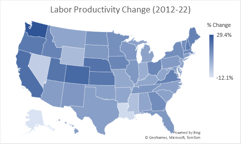
Finally, it is worth considering productivity experience of U.S. states and geographic regions — over both the last decade and also most recently as experienced from 2021-22 (a period of declining productivity nationally). The first map below depicts % changes in labor force productivity over the decade long period of 2012-22. Darker colors are noted for states with greater productivity increases.

Source: BLS.

#1 in productivity gain for the U.S. over the last decade is Washington state — led by technology-related firms with an overall 29% gain in output per labor hour. #2 is Colorado, followed by California, Nebraska and Utah.

Alaska is associated with the worst productivity experience with output per labor hour dropping by 12% over the last decade — followed by Louisiana, Nevada, Delaware, Mississippi and Wyoming. With the exception of these six states, all other states experienced some level of productivity gain.

When considered by region of the U.S., western states experienced a 19% productivity gain — most in the U.S. — followed by the northeast and then the midwest. Southern states experienced the lowest productivity gain — up by just over 8% for the decade.

The second map (shown below) depicts the very different and most recent productivity experience of 2021-22. Of the 50 states, 37 have experienced productivity declines with just 13 showing productivity gains.

Source: BLS.

The #1 gainer was Idaho — with productivity up by 4% in just the one year from 2021-22. #2 is Minnesota, followed by Nebraska, Connecticut and Kentucky.

The worst performers for this most recent one-year period were Alaska (down by 7% in one year), followed by Louisiana, Nevada, Hawaii, North Dakota and Mississippi. These appear to be states with strong dependence on tourism and/or agriculture. Four of these states were also among the lowest productivity performers over the last decade (as well as for the most recent year).

In terms of broader regions of the U.S., midwestern states were the least negatively affected from 2021-22 with the west region most adversely affected.

Bottom Line

Two concluding observations:

  • Restoring productivity from the experience of the last year is pivotal to Whip Inflation Now (or WIN) as known during the nation’s 1974-era bout with inflation.

  • Getting there sooner than later requires focus on a successful and fast-paced productivity transition from the baby boomer driven economy of the last 30-40 years to the increasingly millennial and GenX reliant cohorts of today’s labor force — including but not limited to commercialized artificial intelligence (AI) applications.

For comments on this blog post or to request inclusion on my email notification list for future E. D. Hovee blog posts, please email, addressed to: ehovee@edhovee.com

Also note: A listing of and links to past blog posts is available at:
Blog Post Listing.

WAGE GAINS - FOR BETTER & WORSE

With this blog post, I review changing hourly wage rates across the U.S. economy from 2012 to present (as of April 2023). Considered is the pattern of month-to-month changes and overall trends pre- and post-pandemic by economic sector.

Key observations are essentially three-fold:

  • The pace of wage growth has accelerated over the last decade — both as a contributor and response to inflationary pressure.

  • From the pandemic to present, annualized wage gains have ramped up to more than double the pace of wage increases pre-pandemic — also wage trends are now more volatile than previously experienced.

  • Workers most benefitted — especially since 2020 — have been retail and hospitality at the lower end of the wage scale. Their recent gains are long overdue and would be jeopardized if the U.S. now goes into recession in the continued fight by the Federal Reserve to bring inflation back too quickly to the Fed’s 2% annual inflation target.

Monthly Change Pattern & Volatility

The following graph depicts monthly changes in year-over-year % wage changes across all private non-farm employment in the U.S. Changes are calculated as the average of a particular month’s average wage as compared with the same month’s wage figure one year earlier.

Source is U.S. Bureau of Labor Statistics Current Employment Statistics (BLS/CES). Time series data is from January 2012 - April 2023 with one month’s change calculated relative to the the same month one year earlier. For example, the change figure for January 2013 is calculated as the % change from January 2012 to January 2013. The curvilinear trend is calculated as an exponential function which provides a better albeit imperfect statistical fit (or R-square) than a straight-line linear trend. the BLS/CES data series does not include wage rate data for the governmental sector.

Over this full time period from 2012 to 2023 year-to-date (YTD), overall private sector wages have increased by a compound annual growth rate (CAGR) of 3.4% per year. Two distinct periods can be identified over this approximately 10-year time frame:

  • Wage rate increases averaging 2.5% per year from 2013-19 — albeit with monthly variations of generally up to about +/- 1% point above or below the overall trend.

  • Wage rate growth escalating to a 5.4% annualized rate from 2020 (with pandemic) to 2023 YTD — and with substantially greater month-to-month volatility.

Much of the monthly change volatility is associated with disparate employment impacts of the pandemic. For example, the nearly 8% wage spike of April 2020 reflects mass layoffs early in the pandemic — concentrated with lower wage retail and hospitality (including dining) sectors. With low wage sectors laid off, the wage average for all remaining employed workers increases — in this case a skewed indicator of overall worker prosperity.

Also noted is the upward trend in wage rates over this full time period - gradually occurring even pre-pandemic. For example, annualized wage increases averaged 2.0% year-over-year in 2013, increasing to a 3.3% annual wage gain in 2019 — then spiking further in subsequent years through the pandemic and subsequent economic recovery. In effect, there was clear evidence of growing upward wage inflationary pressure building throughout the past decade — providing a cautionary warning well ahead of the CPI inflationary spike coming to a head in 2022.

Of most recent concern — especially for the Federal Reserve — is the increase in wage rates from a 4.2% annualized rate in March 2023 to a 5.1% increase in April. This suggests potentially more difficulty ahead to dampen inflation — especially if primary reliance continues to be placed on interest rate increases to achieve the Fed’s 2% long-term annual inflation rate objective.

Wage Gains by Sector

A deeper dive is possible by reviewing wage rate experience by sector — also distinguished by pre-pandemic versus 2020 to present experience. This is illustrated by the following chart covering 13 major sectors of the private sector U.S. economy.

Source: BLS/CES Governmental sector wage information is not provided by this BLS dataset, as wage information is limited to private sector non-farm employment.

As indicated by the graph:

  • From 2013-19, the most rapid wage gains pre-pandemic occurred with the information sector — largely attributable to software and internet related employment — with wages increasing by just over 4% on an annualized basis. Of added note is that the historically low-wage leisure and hospitality sector experienced the second highest rate of wage gains, up by just over 3% per year.

  • From 2020-present, leisure and hospitality moved up to #1 wage gainer, with wages increasing at an annualized rate of 7.3% per year — followed by retail workers with wages up at a nearly 6% annual rate. This has occurred in response to the great difficulty of re-hiring lower wage customer service (or front-line) workers laid off in the pandemic — with resulting pressure to hike wages (and benefits) as a means to entice workers back.

What About Government Workers?

While the BLS Current Employment Survey (CES) does not provide wage information for government workers, a separate Quarterly Census of Employment & Wages (QCEW) database does provide public sector wage data — in terms of average weekly wages. As of the 3rd quarter of 2022 (for the most recent information currently available), the average weekly wage for federal employees was 148% of the average wage across all industry sectors. State government was 9% and local government 1% above the all industry average. Despite more rapid pay increases recently, leisure and hospitality wages had moved up to just 45% of the all industry average (as of 2022/Q3).

In terms of changes, leisure and hospitality wages have improved their position relative to the government sector, especially in the most recent period from 2019-2022/Q3. Within government, state and local governments have experienced more rapid wage increases since 2019 — but still remain well below average federal pay levels.

Take-Aways

While unfortunately the private and public sector data are not fully comparable, it appears that the greatest beneficiaries of upward wage pressure over the last decade (and especially from 2020 to present) have comprised two very different groups of U.S. workers:

  • Lower paid hospitality and retail workers — whose recent and long-overdue pay increases have provided improved equity across the wage spectrum — but for whom further gains could be jeopardized if the U.S. economy goes into recession in an effort to bring inflation back too quickly to the Fed target rate of 2% per year.

  • Government employees — especially those employed by state and local governmental entities — whose wage increases through the pandemic and recovery have exceeded average wage gains across all private and private sector workers combined. These public sector workers generally were already receiving pay at or above the all industry average (except for those in local government).

To summarize, this review indicates that the pace of wage growth has accelerated over the last decade, first as a contributor and then a response to inflation. With the pandemic, wage gains have ramped up to more than double the pace of payroll gains experienced pre-pandemic. And paradoxically, while inflation negatively affects most households, lower income service workers have at least benefited from above average wage gains — a benefit long overdue.

Postcript: ChatGPT on BLS Wage & Hours Data

In compiling comparative wage information for this blog post, the following data question surfaces:

Why doesn't the U.S. Bureau of Labor Statistics report wage and hours data with its CES survey for government employment when this data is included for other employment sectors?

Not readily finding the answer via a quick Google search, this question was posed to ChatGPT. Here is the response of May 4, 2023:

The U.S. Bureau of Labor Statistics (BLS) collects and reports data on employment, wages, and hours for various industries and sectors through a number of surveys, including the Current Employment Statistics (CES) survey. However, the CES survey does not include wage and hours data for government employment.

One reason for this is that government employment is typically subject to different laws, regulations, and collective bargaining agreements than other sectors. As a result, the collection and reporting of wage and hours data for government employment requires a different approach and may involve additional challenges.

Furthermore, the BLS does collect and report data on wages and hours for government employees through other surveys, such as the National Compensation Survey (NCS). The NCS is a separate survey that focuses specifically on compensation practices and trends for private and public sector employees in the United States.

In summary, the BLS collects and reports data on wages and hours for various sectors and industries through different surveys, and the exclusion of this data from the CES survey for government employment is likely due to the unique nature of government employment and the need for specialized data collection methods.

Helpful, yes - somewhat. However, the answer remains not entirely clear.

For comments on this blog post or to request inclusion on my email notification list for future E. D. Hovee blog posts, please email me, addressed to: ehovee@edhovee.com

Also note: A listing of and links to past blog posts is available at:
Blog Post Listing.

POST PANDEMIC - WINNERS & LOSERS

In 2016, I prepared a review of changes in U.S. employment subsequent to the Great Recession of 2007-09, web-link: Post-Recession Winners & Losers. Seven years later, I have now updated the analysis to address strong and lagging sectors of the economy through the COVID pandemic and subsequent recovery. Time period for this review is from 2019 (a peak employment year just prior to the pandemic) to 2022 (with post-pandemic recovery to date).

The story with this update: plenty of change but no huge surprises. With opportunities for again reshuffling the deck of employment winners and losers in the years ahead.

Strong & Lagging Sectors

Strong and lagging sectors of the U.S. economy are visually represented by the following chart. Covered are 12 major non-farm sectors - in terms of current employment size, job change and wage change:

  • Relative 2022 employment size of each sector is indicated by the size of its named circle/bubble.

  • Change in employment from 2019-22 is indicated by the X-axis. Sectors to the right of the chart have experienced stronger job growth (numerically) than those to the left with lesser employment growth or job loss.

  • Hourly wage change is indicated by the Y-axis. Sectors to the top of the chart experienced stronger gains in hourly wage rates than those below — albeit with no accompanying wage data published by the Bureau of Labor Statistics (BLS) for the governmental sector.

Big Picture Look

What the data shows is that the U.S. had a total of 152.6 million non-farm jobs as of 2022. This represents a 1.1% (or 1.7 million job) increase over pre-pandemic (2019) employment of 150.9 million.

Average hourly wage for non-governmental employment has increased by 15% over this same 3-year time period.

Sectoral Highlights

Key highlights are summarized as follows:

  • Private education/health services represents the single largest sector of the U.S. economy ad of 2022, accounting for 24.35 million jobs followed by professional and business services, then government.

  • Leisure/hospitality, retail trade and manufacturing and come in at the 4th, 5th and 6th largest sectors. Together the top 6 sectors now account for over 113 million jobs (or 74%) of U.S. non-farm employment.

  • Net job increases over the past three years are accounted for primarily by two sectors — professional/business services and transportation/warehousing — together representing over 100% of net job growth in three years. Other sectors experienced more anemic job growth including five sectors for which employment had not yet recovered to pre-pandemic levels as of 2022 (meaning continued net job loss).

  • In terms of pay, the #1 gainer was the relatively small utilities sector — with hourly wages up by about $5.70 per hour over this 3-year time period. Strong gains in dollar terms also are noted for financial and professional/business services — with high percentage increases noted for traditionally lower paid leisure/hospitality and retail sectors.

Taken together, sectors with strong employment and/or wage growth through the pandemic and beyond are professional/business services, transport/warehousing (i.e., the Amazon effect) and financial services. Leisure/hospitality and government are associated with the greatest net job losses with other sectors relatively tightly clustered in terms of employment and wage increases.

Comparison with Recovery from the Great Recession

Key points of comparison with experience of 2010-15 recovery from the Great Recession and more recent experience with the pandemic and ensuing re-normalization through 2022 recovery are noted as follows:

  • Both then and now the #1 job gainer nationally was with professional and business services. A surprise growth sector through the pandemic was with transportation and warehousing (as the Amazon effect with less brick and mortar retailing).

  • Leisure and Hospitality (including dining) was a major source of job growth coming out of the Great Recession; employment in this sector has yet to recover from experience of the COVID pandemic and associated business curtailments. Government (federal, state, local) which was losing employment in the 2010-15 period is continuing to shrink its employee job base (not counting contractual services) more recently through 2022.

  • From a wage perspective, by far the greatest jump in compensation from 2010-15 was experienced by the information sector, notably in software. More recently, the largest pay gains (in $ terms) have been with professional/business and financial services — as well as with the much smaller but high paying utilities sector.

Looking Forward

Whether and to what extent these changing patterns of job and pay persist or shift yet again remains to be seen. Look for potential break-out performances ahead to the mid-2020s for one or more of the sectors near the center of this most recent performance cluster.

Domestic manufacturing may benefit from de-globalization and re-shoring. Information may transition from focus on consumer interests to needs for improved workplace productivity and AI/automation. Health care employment may surge to serve rapid aging of the population, especially if public/private cost and funding issues are better addressed. And construction may benefit from multiple sources — addressing the residential supply gap, renewed industrial investment and/or national energy and infrastructure priorities.

U.S. STOCKS - POST INVASION

In April of 2022, this blog reviewed changes in stock market performance in the year prior and also the just over six weeks period subsequent to the Russian invasion of Ukraine launched February 24, 2022. This blog updates the review to cover the post invasion experience 1-year later in two parts:

  • For the full year of February 24, 2022 to February 24, 2023; and

  • For the most recent portion extending from the 2023 New Year to present or year-to-date (YTD).

As with last year’s review, the analysis is organized to cover the 11 key sectors of the U.S. economy as included with the S&P 500 index. Not surprisingly, stock performance by business sector since this New Year’s Day varies considerably from that of the full year since the Russian invasion — with implications for the rest of 2023 if not beyond.

The Full Year Look

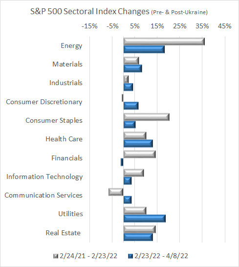
The graph below depicts performance for the full year since the invasion (shown by the gray bars) vis-a-vis the most recent experience since the start of 2023 (blue bars). For the full year:

  • The S&P 500 index declined by 6.0%. This was greater than the 1.0% valuation loss of the Dow (DJIA) and the 2.8% loss of the Russell 2000 index but much less of a loss than the 12.6% valuation decline of the Nasdaq.

  • From a sector-by-sector perspective, the energy sector was the big winner — with a 26% year-over-year valuation gain (much of which occurred early on around initiation of the Ukrainian conflict).

  • At #2, industrials came in well behind #1 with a valuation gain of just under 5%. The only other sectors showing (modest) valuation gains were utilities and health care.

  • The other seven S&P 500 sectors all showed losses for the year led by communication services (with a 22-23% valuation loss). The long vaunted information technology sector experienced an 8% sell off of market value.

Focus on 2023 YTD

Performance of the market since the 2023 New Year (shown by blue bars) is considerably different from that of the full year since the invasion:

  • For the S&P 500, the market has reversed the full year loss to indicate a gain of 3.4% since opening day of January 3 — although much of this gain happened in January followed by much weaker performance in February.

  • The consumer discretionary sector (i.e., higher end purchases) has been the strongest performer, up by just over 11% YTD. This is a major reversal of its 10th place full year performance compared to what has occurred in less than the last 60 days.

  • Six other sectors have experience positive YTD valuation performance — ranked in order as a resurgent information technology sector, then communication services, materials, financials, real estate, and industrials.

  • Four sectors have experienced valuation losses for YTD 2023 — led by utilities at a negative 6%. As the star valuation gainer of the early Ukranian experience, energy has gone from # 1 performer for the full year to #9 when considered for the more recent time frame since the 2023 New Year (with valuation loss of 4%). The other two sectors showing valuation losses YTD are consumer staples and health care.

Looking Ahead

The remainder of 2023 offers the prospect of continued volatility for the stock market — across the spectrum of institutional, professional and individual investors. With experience of the Great Recession followed a decade later by the COVID pandemic, both now largely in the rear view mirror, attention turns to the continuing and most recent dynamics of market and economic transformation — both domestically and globally.

The forces of this transformation include transitory and structural inflation, supply chain reshoring, labor force and housing shortages, a rapidly aging population, declining productivity and need for automation, uncertain trajectory of energy transition, financing lock-down, and both domestic and global balkanization. These forces pull in multiple and often changing directions. All have been catalyzed by COVID and now Ukraine.

Fasten the seat belts — for a wild and woolly 2023 — hopefully leading to a better vision of new, new normal looking beyond this year to the remainder of the decade.

For comments on this blog post or to request inclusion on my email notification list for future E. D. Hovee blog posts, please email me, addressed to: ehovee@edhovee.com

Also note: A listing of and links to past blog posts is available at:
Blog Post Listing.

FED FORWARD

On October 26, my blog posed the question: How Fast and Far Should the Fed Go? Now this follow-on post carries the discussion a bit further — addressing two questions:

  1. Are there metrics that represent potentially achievable targets for monetary policy and U.S. economic performance during normalized times — without crisis?

  2. What are the implications for monetary policy of the Federal Reserve and Congressional fiscal policy to achieve a balanced set of outcomes through today’s inflation and anticipated 2023 recession?

This blog post suggests that the nation’s recent experience — of low inflation, interest and unemployment rates — represents an outlier not likely to be readily re-experienced anytime soon. The Fed is likely to experience difficulty getting back to 2% inflation except at high and perhaps unacceptable economic cost. The current federal response appears to be one of hurry up and slow down — with a Congressional foot on the accelerator even as the Fed’s foot presses on the brakes. A better coordinated and more sustainable approach is warranted going forward.

Historical Performance

This post focuses on four metrics as indicators pivotal to assessing performance of the U.S. economy: CPI inflation, federal funds rates set by the Fed, conventional 30-year residential mortgage rates, and unemployment. Monthly conditions for these four key metrics are visually portrayed by the following graph — covering the period from 1963 - present for which data is available.

Source: FRED data of the St. Louis Federal Reserve. Data is through the month of November 2022.

There is more going on with these four data sets than can be readily absorbed and interpreted by the human brain. What is clear is that there are clearly periods of abnormal economic behavior — as occurred during the mid 1970s, early 1980s, 2008 and most recently with the pandemic followed by inflationary run-up of 2020-22.

Normalized Performance

What is less clear from this initial look is the determination of what might represent normalized (or typical) economic behavior over this nearly 60-year time frame. And if a typical (or average) experience can be identified, is it relevant as a basis for targeting future performance going forward?

This second graphic (below) illustrates the average multi-year performance for each of the four metrics. Also shown by way of comparison is a calculation for each metric’s median figure.

Source: FRED and E. D. Hovee. Data is up through the month of November 2022.

As indicated, the average annualized rate of inflation over this full 59 year period is just under 3.9% per year. The effective federal funds rate comes in about 1% point higher at 4.9% per year, averaged over the same time period.

Mortgage rates have averaged over 7.6% — including some very high rates as experienced in the 1980s. Over this historical time period, mortgage rates typically have averaged about 2.7% points above the federal funds rate for the corresponding point in time.

And from 1963-2022, unemployment nationally has averaged just under 6% of the U.S. labor force.

Median figures are also indicated for each of the four metrics considered. The median is calculated as the observation mid-way between the high and low figures included across the full time period considered. For each of the four metrics, the median estimate is below the calculated mean (or average). This occurs as there are some very high (spiking) figures that skew the averages above what the mid-point figure would otherwise indicate.

Sequentially, the inflationary cycle typically unfolds with increased cost of living which subsequently is responded to by increasing the federal funds rate in an effort to reduce demand and bring the rate of inflation down. However, this does not happen overnight and effects can be less than fully predictable.

Funds rates set by the Fed then affect interest rates on the private market — ranging from cost of corporate debt to mortgages and household debt. Higher costs associated with repaying debt results in reduced demand for economic activity sensitive to the cost of credit for borrowing — which then leads to slowing of the U.S. economy and increased unemployment with private and public sector job reductions.

COMPARISON WITH CURRENT EXPERIENCE

Clearly, these long-term averages represent typical conditions that are at substantial variance with U.S. experience of the pandemic and its immediate aftermath. Until early 2022, inflation was viewed as a phenomenon of the past. Interest and unemployment rates were at historic lows.

Recent experience represents an outlier — not representative of the norm. For 2023 and beyond, is there any reasonable expectation of reverting to a world of low inflation, interest rates and unemployment? If not, what are the implications of downshifting to the norm in the years ahead?

RATE LINKAGES TO CPI

To address these questions, it is useful to again review the typical relationships that have been experienced between inflation and the associated response of the other economic metrics considered:

  • Fed funds rates have averaged about 1% point above the rate of inflation

  • Conventional residential mortgages average approximately 3.7% above the rate of inflation

  • And unemployment averages just over 2% points above the inflation rate

This would suggest that if policymakers target 2% as the desired normalized rate of inflation, the fed funds rate should average about 3% with mortgages in the range of 5.7% and unemployment averaging just over 4%. These might be considered as target averages over the full economic cycle — with interest rates and then unemployment peaking at different times (generally behind) peaking inflation.

For the economic cycles considered since 1963, the time period from the initial signs of inflation to the subsequent credit tightening and peaking of unemployment has ranged widely from 18-66 months, averaging about 40 months. The fastest cycle was experienced from 2010-12 (following the Great Recession); the longest cycle from 1987-92 (part of the economic time period termed as the Great Moderation).

2023 Forecast

Given current domestic market and global circumstances, what is reasonable to expect for this coming year? Two observations stand out:

  • The Fed will have a difficult time getting inflation under control — at least back to a 2% target rate that would enable meaningful interest rate reduction. Impediments to achieving target CPI inflation reflect both demand- and supply-side considerations. The primary demand-side issue is continued excess fiscal stimulus — most notably with the end of 2022 Omnibus federal funding. Taken together with previous historically high stimulus the result is simply more spending capacity than the level of goods and services that can reasonably be delivered. The result will be continued upward pricing pressure.

Demand pressures will be exacerbated by supply-side constraints — further increasing upward consumer pricing pressure. The good news is that supply-chain bottlenecks appear headed toward successful resolution — with increased inventories (as with semi-conductors) and improved return to more normalized global shipping delivery schedules. The bad news is that while now easing somewhat, significant labor shortages can be expected to persist — perhaps through this decade — as massive exodus of baby boomers from the labor force are not easily replaced by smaller incoming workforce (as with Generation Z).

An added supply issue with uncertain resolution relates to adequacy of reliable energy supplies. Continued public policy favoring a rapid green transition reliant in the near term on added international rather than domestic sources at competitive prices will create ongoing supply uncertainties with resulting bottlenecks and attendant upward pricing pressures.

  • Unless the Fed changes course, the nation runs the risk of an unnecessarily severe recession and subsequent challenging recovery. To offset the excessive fiscal stimulus, the Fed and its chair Jerome Powell appear to feel compelled to apply the brakes more forcefully and over a longer duration than is the case in the recessionary portion of a typical business cycle. Even more challenging is that with its monetary tool kit focused on demand reduction, the Fed will be much less effective in addressing supply-side issues including continued labor and potential on-going energy shortfalls. Addressing these issues will require action that extends largely beyond the Fed’s capabilities.

Policy IMPLICATIONS

Major observations are summarized as follows:

  1. Based on experience of the last nearly 60 years, supportable average normative benchmarks appear to include 4% inflation, 5% federal funds rate, 7-8% conventional mortgage financing and 6% unemployment.

  2. However, this historically normalized experience reflects an economy that typically runs considerably cooler than what was has been experienced with recovery from the Great Recession of 2007-09 and more recently through the pandemic and initial recovery from 2020-21.

  3. In short, running a hotter economy in recent years appears to be inconsistent with long term experience and unsustainable without eventually having to pay a substantial price — especially if interest revert back to the long-term norm rather than to the experience of the last several years.

  4. The current Fed target of 2% inflation also appears inconsistent with and perhaps an unreasonably optimistic expectation of a sustainable long-term outcome; more likely is that inflation runs above the 2% target pending re-normalization of labor force supply, improved productivity and shift to an adaptive yet more sustainable energy capacity.

  5. If the Fed proves unable on its own to tame inflation at reasonable economic cost, consideration of a major change in institutional arrangements may be warranted — to assure better and more consistent coordination of Fed monetary with Congressionally authorized fiscal policy.

HURRY UP AND SLOW DOWN

At this point, the American economy can be likened to an automobile with one foot on the accelerator while the other foot is slamming on the brakes. The more that Congress steps on the gas, the more it is that that the Fed feel compelled to jam on the brakes.

No form of transportation can withstand these countervailing forces for long without trashing the vehicle. And no nation can readily withstand the on-going whiplash of these opposing forces without considerable harm to its workforce, business vitality, consumer and social service capacity, housing affordability (especially for millennials), investment returns (especially for retirees), and fiscal sustainability.

Welcome to 2023!

For comments on this blog post or to request inclusion on my email notification list for future E. D. Hovee blog posts, please email me, addressed to: ehovee@edhovee.com

Also note: A listing of and links to past blog posts is available at:
Blog Post Listing.

U.S. HOUSING DEMAND TWO DECADES AHEAD

One year ago, I evaluated the changing face of U.S. housing demand — looking a decade ahead. A key finding was that aging baby boomers age 75-84 can be expected to represent the #1 source of net housing demand across the U.S. through to 2029. That year ago blog is available by clicking on this link for:
The Changing Face of U.S. Housing Demand.

This current post carries that analysis one step further — addressing the question: What then will be the changing face of housing demand two decades ahead? The story-line for the next two decades might best be summed up as housing famine, then feast.

Three preliminary conclusions emerge from considering U.S. housing needs not just over the 2020s, but into the 2030s:

  • The housing market will be whipsawed by the aging and then dying baby boom generation over these two decades — with extraordinary demand in the 2020s followed by a potentially glutted market in the 2030s.

  • Addressing the rapidly changing dynamics of baby boomers will help to smooth market function for other age cohorts — especially the large millennial cohort who today are scrambling for affordable and increasingly family-friendly housing.

  • Finally, shifting to a mix of more rental and less ownership product can facilitate more efficient market response than likely will otherwise be possible.

Review of 2019-29 Forecast

As noted, the #1 finding of the earlier analysis covering our current decade is that aging baby boomers age 75-84 represent the single largest source of net household growth from 2019-29. As illustrated by the following graph, this older boomer cohort age is followed by younger boomers age 65-74 as the 2nd largest source of housing demand (by age of householder).

Note: This forecast assumes in-migration to the U.S. represents a 3.4% increase in population each decade. A similar assumption is applied to the 2029-39 projection below.

Taken together, those age 65-84 can be expected to account for an estimated 94% of the net change in housing demand — for an added 9.7 million households nationwide — over this current decade. Millennials age 35-44 represent 26% of added household demand. Other working age adult cohorts of those under 34 and those 45-64 represent flat or declining shares of U.S. housing demand.

So, What About Two Decades From Now?

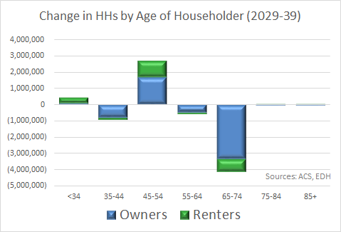
From 2029-39, the U.S. housing market takes another abrupt turn — as illustrated by the following graph.

Three key findings are of note:

  1. Over a 2-decade horizon, all household age cohorts (except those millennials who are by then age 45-54 and a small number of those under 34) will represent declining household demand. Baby boomers who all will be passing through their 70s and 80s will no longer represent a source of household growth as those who graduate into this age cohort will be offset by generally older counterparts facing mortality. Retirees age 65-74 will represent the largest reduction in net housing demand as the previously large cohort of aging baby boomers is offset by a much smaller population of maturing Gen X householders.

  2. Total housing demand will shrink from a need for an estimated 9.7 net new housing units in the current decade to a net reduction of 2.6 housing units in the following decade of 2029-39. If this scenario plays out consistent with current demographic trends, the nation’s current housing shortage will be replaced by housing surplus.

  3. Finally, as visually depicted below, the housing surplus that emerges from 2029-39 can be expected to be greatest for owner-occupied units — while rental demand two decades out remains essentially flat.

Implications

Detailed discussion was provided by my prior blog post of implications of the 2019-29 housing demand shift now underway. What are we to make of the initial outlines of what might emerge in the following decade of 2029-39? And how are these two decades to be addressed in their totality?

First and foremost, it is clear that the U.S. housing market will be whipsawed by the aging and then dying baby boom generation (those born from 1946-64) over these two decades. Potentially exacerbated by renewed inflation and increased interest rates, it appears increasingly challenging to keep up with extraordinary housing demand now being experienced through the 2020s — only to be followed by market glut in the 2030s. Making these market transitions less abrupt and financially wasteful should be an objective of both private industry participants and public sector policy initiatives appropriate now and in the years ahead.

Second, addressing the unusual dynamics of the now intense followed by fading baby boom dynamic will help to smooth market functionality for other age cohorts — especially the also large grouping of millennials who today are scrambling for affordable and increasingly family-friendly housing. The sooner that boomers can be enticed out of large single family home-ownership product into other existing right-sized and/or new innovative senior housing offerings, the easier it will be to serve other market demographics with less risk of long-term single-family residential overbuilding.

Third and finally, while home ownership likely will remain an important part of the American dream for generations to come, shifting to a mix of more rental and less ownership product can serve to facilitate more efficient market response than would be otherwise possible. Rental housing fits more with an ever more urban demographic profile of the American housing and can more rapidly be built, adapted from other uses and/or removed from the housing inventory in response to changing market conditions than single-family ownership product.

For comments on this blog post or to request inclusion on my email notification list for future E. D. Hovee blog posts, please email me, addressed to: ehovee@edhovee.com

Also note: A listing of and links to past blog posts is available at:
Blog Post Listing.

HOW FAST & FAR SHOULD THE FED GO?

Note: this blog has been updated (most recently as of December 19, 2022) for more recent data since first posted on October 26, 2022.

The U.S. economy is in the midst of an unexpected and extraordinary inflationary spiral — peaking at a 9% rate of year-over-year annual inflation as of June 2022. Since World War II, this is exceeded only by inflationary peaks of 12.2% in 1972 (with the OPEC oil embargo) and 14.6% in 1980 (with the dot-com bubble).

After a prolonged period of near-zero interest rates set by the Federal Reserve, the Fed has now aggressively taken on the task of rapidly increasing the Fed Funds rate, with monthly rate increases of 0.25% points starting in March, increased to 0.50% in May, then with subsequent increases of 0.75% points in each of the months June, July, September and November — with a somewhat reduced 0.50% increase in December.

Prior projections indicated that the Fed anticipated its median target rate to be in the range of 4.6% by the end of 2023. With the December 2022 rate bump, the fed funds rate increased to 4.25-4.5% — with further increases now anticipated to reach a range of 5-5.5% in 2023.

The question is whether the Fed has been raising rates too fast — with risk of a hard landing and economic recession ahead in coming months. The opposing argument is that the Fed needs to move even more aggressively, before inflation rates of 9-10%+ per year get baked-in to the U.S. economy.

To help address this question, this blog post takes a look at the post-WWII experience of American inflation, the response of federal fund rates, and changes in economic performance (using the bellwether metric of unemployment rates). We look at two types of inflationary periods — those largely demand created and those reflecting supply shocks (including periods as at present reflecting a combination of demand and supply-side challenges).

Looking ahead, it is essential to recognize that the Fed has a limited set of monetary tools available. These tools are best suited to tackle the demand-side portion of the current inflation run-up — albeit dependent on reasonable domestic consensus for public fiscal as well as monetary restraint. Supply-side constraints are largely beyond the Fed’s direct purview but will depend on addressing supply bottlenecks one at a time, focused on resiliency and productivity of U.S. industry and labor force.

The Big Picture Look

As illustrated by the following (rather complex) graphic, 11 periods of inflationary bouts can be identified over a 68 year time frame from 1954 to present. Across the full timeline, corresponding metrics of annual CPI inflation, the effective Federal Funds rate and unemployment rate are depicted.

Source: FRED data of the St. Louis Federal Reserve for all graphics of this blog and associated analysis. The above graph encompasses monthly data points with CPI inflation and unemployment rates seasonally adjusted — together with the effective federal funds rate. Inflation cycles are illustrated by portions of the graph with blue background. Each period begins with an uptick in annual CPI (from the prior month) and ends following a subsequent month of peak unemployment.

The longest inflationary cycle noted covers a 10+ year the period extending from April 1959 to December 1970 — with modest inflation over about half of this time frame, accelerating thereafter. The shortest inflationary run-up followed by unemployment peaking occurs over a 26-month period from August 2007 to October 2009 through the Great Recession of 2007-09.

Demand-Driven Inflation

Of the 11 inflationary periods identified, six appear to have been driven primarily by excess demand in the U.S. economy — outstripping normalized productive supply capacity. Perhaps the poster child of this type of inflation and resulting Fed response is illustrated by the 2004-07 latter portion of the era known as the Great Moderation, including passing of the Fed baton from then Chair Alan Greenspan to Ben Bernanke.

As shown by the following chart, this was a time of sustained low unemployment (trending down from less than 6% to arrive closer to 4%) and of moderate annual CPI increases (ranging from less than 2% up to just nearly 5%, then dropping back down). This is also the one historical period over which the Fed methodically and systematically moved up its federal funds rates — starting at 1% in May 2004, increasing step-by-step (averaging about a 0.17% point increase per month) to just over 5% by June 2006.

Note: Areas shaded in gray at the left and right edges of the graph indicate rates in the month just before and then just after the period which is the focus of this time period.

This mechanistic approach to Fed intervention appeared to have worked remarkably well over the period in question. The Fed intervened to successfully choke off inflation that peaked in September 2005 without adversely affecting employment for American workers. In fact, the unemployment rate actually declined.

However, subsequent history has been less kind to Mr. Greenspan. Within a few months of this inflationary cycle, accommodative Fed policy (and subprime mortgage lending) would give way to the Great Recession of 2007-09. In short, monetary policy reliant on federal fund rates on its own proved inadequate to address the financial and economic tsunami just ahead. Structural and regulatory reform was also needed but despite advance warning did not arrive in time.

There are five other periods of demand-driven inflation that warrant briefly reviewing:

  • The affluent society period of bi-partisan goodwill during the 2nd term of the earlier Eisenhower Administration with continued post-war recovery including a baby boom that increased demand for consumer services, suburbanization and interstate freeway investment across the U.S. Inflationary pressures emerged in 1957 but were not adequately matched by monetary tightening, leading to recession in 1958 with accompanying near doubling of unemployment.

  • The guns and butter era of the Kennedy and Johnson administrations as one of the longest periods of economic growth but with fiscal tightening ultimately needed to fund Vietnam War deficits and with federal funds rates increasing to the 9% level accompanied by resulting recession and unemployment in 1969-70.

  • A period of elevated but stable unemployment with double-dip recession in the Ford-Carter era of 1976-80 with rising inflation matched by similarly aggressive increases in Fed funds rates to an all-time high rate level reaching nearly 18% — albeit with only minor changes in the already elevated U.S. unemployment rate over this period.

  • A nearly 6-year portion of the Reagan-Bush era extending from late 1986 to mid 1992 with transition of Fed Chair from Paul Volker to Alan Greenspan — during which Fed fund rates increased to about 10% to address rising inflation but with relatively stable unemployment maintained until the early 1990s as interest rates ultimately proved to be held too high for too long.

  • And finally, the portion of the Obama presidency from late 2010 to mid 2012 as the Fed maintained unprecedented accommodative monetary policy of nearly 0% interest with recovery from the Great Recession and slowly declining unemployment from about 10% to 8% and with inflation briefly doubling up to the 4% level then back to 2% (a reflection of continuing post-recession labor force slack in the economy).

Supply-Side Inflation

Less appreciated but important for this current inflationary bout is the potential significance of supply-side inflation. This can be driven by factors ranging from supply chain gaps (as with increased delays in shipments) to workforce availability not adequate to meet employer needs. In many but not all cases, supply-side inflation occurs unexpectedly from external shocks as with the war in Ukraine with resultant production curtailments on globally important supplies ranging from petroleum products to critical food supplies (as with grains).

Of 11 inflationary experiences documented since WWII, five appear to involve clear supply-driven shortages leading to increased pricing. Perhaps the classic case of supply-side inflation occurred with the OPEC oil embargo of 1973-74. The effects on CPI, Federal funds response and resulting economic performance (as measured by unemployment) are illustrated by the following graph.

The oil crisis took hold in October 1973 when OPEC members led by Saudi Arabia enacted an oil embargo on nations that had supported Israel during the Yom Kippur War. By the end of the embargo in March 1974 the price of oil had risen by nearly 300% globally, more in the U.S.

Inflationary pressures were already being felt on the U.S. economy and by late 1974 the U.S. CPI had increased by 12.2% over prior year levels. The Federal Reserve moved quickly and aggressively in an attempt to quell this unprecedented inflationary spiral, raising the Federal funds rate to a peak of 12.9% as of July 1974. Inflation eventually did come down, but with significant reductions not apparent until early 1975.

Unemployment rates went from about 6% to 9%, before finally starting to drop in May 1975, about 1-1/2 years after the embargo had been placed.

Fed action is clearly warranted with demand-driven inflation. However, in this instance, with inflation almost totally supply-driven, the Fed’s reliance on increasing interest rates seems clearly misplaced. Fed actions served to increase interest rates and unemployment — an unnecessary double blow to the American economy and with little direct effect on oil price inflation. With some recognition as to the limitations of a monetary response, the economic blow was further compounded by the imposition of wage and price controls by the Nixon Administration. The result was the worst of all worlds — stagflation persisting with subsequent and renewed economic crises into the early 1980s.

There are four other instances identified of inflation involving a significant supply-side component. However, these are somewhat more perplexing to unravel as demand factors also came into play — increasing the challenge of finding and executing an appropriate, effective policy response. These four other supply-side inflationary episodes are briefly outlined as follows:

  • The dot-com bubble and 9-11 attacks of 2000 reflect the combined effects of demand- and supply-driven inflation — with inflation going from about 1-1/2% in early 1998 to a peak annualized rate of 3.76% as of March 2000 — remaining at elevated levels into early 2001. Fed funds rates increased somewhat from less than 5% to 6.5% before quickly dropping as inflation subsided but with some relatively modest and on-going increase of about 2% points in nation-wide unemployment rates.

  • The period of the 2007-09 Great Recession was kicked-of by a doubling of the inflation rate from the range of 2% to 4% between August and November 2007 with inflation further peaking at 5.5% as of July 2008. Due to the collapse of credit (affecting homeowners, businesses and banks), the Fed lowered interest rates continuously throughout this period, going from a Fed funds rate of over 5% as of August 2008 down to 0.12% by October 2009. Unemployment increased from 4.6% to 10% over the same period. This clearly was a case where the federal funds rate was largely irrelevant to combat inflation; shrinking consumer demand coupled with financial instability is what made the transition to a lower inflation environment possible.

  • The experience of 2015 to mid 2019 yielded different outcomes with both demand and supply factors driving inflation. Fiscal stimulus factored in during the Obama administration followed by both supply-side deregulation and protectionist policies with Trump’s presidency (pre-pandemic). CPI inflation increased from less than 1% to nearly 3% by early 2017, dropped to 2% before returning to the 3% range by summer 2018 and back to 2% or less by early 2019. Throughout this period, fed interest rate policy was mildly restrictive with the federal funds rate going from near zero to about 2.4%. Unemployment declined from less than 6% to under 4% — clearly an example of the monetary policies of Janet Yellen and then Jerome Powell to generate low target rates of inflation while also facilitating robust employment growth.

  • Finally, the current time period of May 2020 to present reflects the sequential effects of the COVID pandemic followed by fiscal stimulus and pandemic recovery leading to resurgent inflation starting in early 2021, plateauing briefly in the 6% range as of Summer 2021 then going to peak levels of 9% year-over-year inflation by mid 2022 — with the demand driver of fiscal stimulus now further complicated by supply bottlenecks related to energy, supply chain management and workforce availability. Federal monetary policy remained extraordinarily accommodative at nearly zero federal funds rates until Spring 2022. Unemployment has continued to drop to an historically low 3-4% range. As illustrated by the following graph, this represents a case where the Fed maintained interest rates too low for too long — perhaps missing the more appropriate tightening window by as much as a year.

Note: This graph may be updated periodically to represent changing current conditions.

With this experience providing the background context, the question now on the table is: Might the Fed now make matters worse by going from too accommodative to too restrictive?

Metrics Anyone?

Looking back over nearly 70 years of experience, it is fairly clear that the management of interest rates (specifically fund rates) by the Federal Reserve has been fairly idiosyncratic — depending on the economic philosophy and predilections of Fed Chairs and Governors of each era in addressing widely varied economic conditions.

The Federal Reserve Act mandates that the Federal Reserve conduct monetary policy "so as to promote effectively the goals of maximum employment, stable prices, and moderate long-term interest rates." Even though the act lists three distinct goals of monetary policy, the Fed's mandate for monetary policy generally boils down to a dual mandate of maximum employment as one mandate and with stable prices plus moderate long-term interest rates as a second mandate.

However, in practice the first stated goal of maximum employment consistently takes a back seat to the job for which the Fed has the most experience — managing inflation and setting interest rates. In effect, acceptable employment (or unemployment) levels may fluctuate up or down as a residual resulting from Fed actions aimed primarily to address price stability and interest rates.

What can be determined is that there are substantial differences that accompany demand- versus supply-driven (or combined) conditions for inflation. On the one hand, the Fed has been prepared to more aggressively ratchet up interest rates in demand-driven periods of inflation. On the other hand, the Fed has also been willing to accept higher levels of unemployment to combat supply-driven (or supply plus demand-influenced) inflation.

Trough to peak rates of unemployment increase by nearly double in supply- and combined periods of inflation as occurs during demand-only inflationary run-ups. This may be occurring because the Fed has useful monetary tools to address the demand side of inflation but little in its tool-kit to address supply-driven inflation.

This peaking phenomenon is somewhat offset by the duration of the period over which increased unemployment is experienced. Demand-driven inflation tends to be resolved over a longer duration than is the case with supply-driven (or combined demand-supply) bouts of inflation. In large part, this is because supply issues which generally are externally generated tend to be resolved more quickly once the embargo or supply chain issue(s) at hand are addressed (whether privately or publicly). The exception is labor force availability — a supply constraint likely to persist over a longer term due to rapidly changing demographics of the American workforce.

So, How is Current Inflation to be Resolved?

At the outset, it is critical to understand that the current inflation reflects both demand- and supply-driven dynamics:

  • The demand-side of the current price run-up is due to a multiplicity of pandemic and post-pandemic factors largely centered on significant fiscal stimulus creating demand for goods and services that exceed realistic productive capacities — especially in the face of recovery from the COVID pandemic. These conditions are readily understood by the Fed and are addressable by monetary tightening, notably by increasing interest rates to reduce borrowing demand (albeit at the added potential expense of a hard landing with renewed unemployment).

  • The supply-side of inflation is not so readily addressable with existing Fed tools. Some issues ranging from supply-chain shortages and bottlenecks are likely to be ultimately self-resolving through actions of multiple private actors seeing opportunity for added profit at the margin. Other issues may be of longer duration as with reduced work force (due to retiring baby boomers) or commodity and energy supply constraints (catalyzed by the Ukraine conflict and by public policy resistance to increased domestic fuels investment and production).


Perhaps the best metric readily available to identify and quantify effects of supply-side inflation is provided by data regarding productivity of the U.S. workforce. Over the last decade, American productivity has increased by an average of 1.3% per year. However, in 2022 productivity has gone negative to a low of a negative 2.0% year-over-year (decline) as of the 2nd quarter of 2022 — an indicator of how supply bottlenecks and wage increases are putting upward pressure on inflation.


The greatest risk now facing the Fed is the temptation to go for broke to reduce both demand- and supply-side inflation — albeit primarily reliant on the monetary tools most readily available at its disposal. A more practical approach is to take on the demand-driven forces via higher interest rates while recognizing that supply-side issues need to be addressed primarily through other (non-Fed) means.

In the short-term, this may mean living with reduced but above recently experienced rates of inflation until supply-side issues can be addressed one-at-a-time. Public-private cooperative initiative is pivotal for this to happen sooner than later:

  • Recognizing that workforce shortages may remain front-and-center over this decade (and perhaps beyond), key productivity steps are to encourage automation of low-skill/low wage jobs allowing more workers to migrate up the career ladder — also to pursue skills-based in-migration policies.

  • Aligning public policy to encourage more U.S. fuels production for domestic and export use as a short-term expedient until carbon-free technologies prove capable of fully scaling up for replacement of fossil fuels — also allowing reasonable time frames for return on investment to avoid becoming encumbered by stranded, productivity-sapping energy assets.

  • Stabilizing mortgage rate increases to allow for valuation adjustments that will allow home buying to renormalize — also encouraging renewed construction to better meet pent-up demand — especially for family-forming millennials. As the full effects of rate increases to date likely will be somewhat delayed until the spring 2023 typical seasonal uptick in market demand, there is value in waiting to see how home sales and valuations are adjusting before further pursuing continued aggressive interest rate hikes. Letting the market adjust incrementally is preferable to effecting a market crash from which recovery will be more difficult.

Bottom-line, the risk of the current unexpected inflation is the slippery slope toward persistent stagflation — of weakened economic activity coupled with unending cost of living erosion. Getting through this period requires use but not abuse of monetary tools within the purview of the Federal Reserve — coupled with fiscal tools of state and federal governments and the private sector working in partnership for a more productive and inclusive America.

If there is an example to avoid, it would be the Fed’s overly aggressive and relatively ineffective attempt to beat down a OPEC-driven supply-side inflation with demand suppressive tools of the Federal Reserve as experienced during the Nixon Administration. Monetary tools proved ineffective to corral inflation and the nation paid an unnecessarily high economic price with unemployment increasing from 3% to 9%.

In today’s situation: Until CPI inflation shows clear signs of easing, the Fed is justified to continue moving interest rates further upward — systematically and cautiously. in short, slow the rate of fed funds rate increases to a pace allowing for easier and incremental market adjustments — avoiding a hard landing that could unnecessarily imperil U.S. economic prosperity and equitable outcomes for years to come.

LABOR FORCE DEEP DIVE (Part 2)

In my last blog of September 15, Part 1 analysis inovlved a one-decade look-back at labor force and jobs, focusing in on declining labor force participation pre- and post-pandemic. For those who missed the introductory overview of Part 1, you might click here to see the earlier post.

Now with Part 2, we dive a bit deeper. Topics covered include:

  • A state-by-state overview of labor force participation — currently and over the last decade,
    followed by consideration of participation rates by

  • Age of adult population and other pertinent characteristics as for sex, race/ethnicity and children at home,
    ending with

  • The elephant outside the room
    and what to do??

Part 1 focused on the question of getting labor force participation rates back up to where they were a decade ago. This Part 2 posts observes that, even if successful, recovery of labor force participation likely will solve only about 25-30% of the current labor shortage. And the even more unwelcome news is that as long as the workforce supply gap persists, inflationary pressures will also continue.

Let’s get started.

State-by-State Review

This state-by-state review starts with a mapped look at comparative labor force participation rates as of 2021. As shown, Nebraska comes in as #1 — with a labor force participation rate estimated at 70.2% of working age adults age 16+. Other states in the top 5 are North Dakota, South Dakota, Colorado and Utah. respectively. Rocky Mountain and plains states leading the way.

At the bottom of the list is West Virginia with a labor force participation rate of less than 55% — followed by Mississippi, Alabama, Arkansas, and New Mexico. Interestingly, the states both at the top and bottom rungs of workforce participation tend to be rural or with large rural expanses.

Perhaps more noteworthy is a second pass at the map — this time for a comparison of changes in labor force participation from before the pandemic (2019) to recent recovery experience (2021). Somewhat surprisingly, Oregon comes in #1 — increasing its labor force participation rate by 0.7% points from 2019-21. Only one other state — Alaska — has experienced increasing labor force participation over this pre- to recovering pandemic period.

Forty-eight states have experienced declining labor force participation since 2019. Vermont comes in 50th with a 5.9% point decline in labor force participation in just two years — followed by Connecticut, Nevada, Iowa and Virginia also losing significant workforce participation. There appears to be no immediately clear sense of what, if any, characteristics that these states share in common that would explain their uniformly weak recovery experience.

Labor Force Participation by Age

We now take on perhaps the most intriguing characterization of labor force participation — by age of worker over the full period of January 2012 - August 2022. At first blush, there is little that would seem out of the ordinary as depicted by the following graph.

Not surprisingly, the three age cohorts with, by far, the highest labor force participation rates are those in career building age categories of 25-34, 35-44 and 45-54 — all with participation rates in the range of about 80-85% of the populations in their respective age cohorts.

Those age 55-64 show some dis-attachment from the work force — with workforce participation rates dropping to the 65% +/- range. Entry level workers age 16-24 have yet lower participation rates in the range of 55% (with large proportions still in school).

And not surprisingly, those age 65+ show the least continuing attachment in the range of 20% or lower participation rates. We’ll circle back to this cohort in a moment — for the rest of the story.

All age cohorts experienced some temporary loss of workforce participation during the pandemic but with general recovery thereafter. Although workforce participation for all adults declined by 1.3% points from 2012-22, participation increased for every single age cohort 16 and over — with the greatest increase of 2.1% points over the decade noted for those age 25-34.

How can it be that participation declines for the overall population age 16+ but increases for every age cohort from 16-24 to 65+ (and all those in-between)? The rest of the story answer lies with the outsize cohort of aging and retiring baby boomers. Put succinctly, the number of baby boomers now retiring far outweighs the number of new labor force participants age 16-64.

Other Defining Characteristics?

Before getting to this story’s conclusion and its implications, it is also useful to consider other characteristics of labor force participation — including sex, race/ethnicity and presence or absence of children at home.

Sex & Labor Force Participation

As has long been the case, men continue to have higher rates of labor force participation than women. However, that is changing. Over the 2012-22 period, an average of just under 69% of men age 16+ were in the labor force as compared with close to 57% of women. However, over this period, men’s participation rate declined by 2.4% points while that of women declined by just 0.6% points.

Influence of Race/Ethnicity

With a labor force participation rate of over 66%, Hispanic/Latino adults are the most work oriented, followed by those who identify as White at just under 63% and African American/Black at between 61-62%. Over the course of the last decade, the Black participation rate has increased by 0.7% points — above that of Latinos (up by 0.5% points) and then Whites (for whom participation rates dropped by 2.1% points).

Presence/Absence of Children @ Home

Contrary to what one might expect, households with their own children (under 18) at home tend to have higher rates of labor force participation than those with no children in the household. Over the last decade, labor force participation rates averaged 81% for households with children versus 57% for those with no children at home (likely due in large part to being at or closer to retirement than for those with no children present in the household).

Also surprisingly, parents with children under 6 years of age are almost as likely to be in the workforce as those with older children. In the last decade, labor force participation has increased for households with children while declining for households with no children.

This shift has affected even households with very young children (less than 1 year of age). For example, over the last decade labor force participation rates for women with a youngest child under 1 year has increased by 5.3% points, the most significant change for any of the child/parent indicators tracked by BLS.

The Elephant Just Outside the Room

For the past several decades, the baby boom generation (born between 1946 and 1964) has been the elephant in the room — supporting strong growth in labor force and employment. Now the elephant is leaving the room — with only those born between 1957 and 1964 still at or under 65 years of age.

Those who are over 65 seem to be following in their parents footsteps — with labor force participation rates dropping from 73-74% (for those 65 and under) to 19% or less (for those now over 65 years of age). The boomer elephant is now leaving the room — with generally smaller generational cohorts coming in behind.

The following graph compares changes in the distribution of the nation’s population and labor force over the last decade. As illustrated, persons age 65+ accounted for 73% of the growth in the nation’s population (of those 16 and over) from 2012-22. Despite ensuing dis-attachment of many due to retirements, this senior cohort still accounted for more than one-third (34%) of the U.S. net labor force growth over this last decade. Who’s to fill the gap after boomers move into their 80s (now just four years away for those born in 1946)?

Source: U.S. BLS.

Those age 55-64 (including some younger baby boomers) also accounted for more growth in labor force than in population. And those age 25-44 (largely millennials) have contributed both to added population and even more to the nation’s labor force.

The situation is more challenging for the much smaller Generation X cohort as illustrated by the age 45-54 group on the graph. From 2012-22, both the shares of population and labor force of those age 45-54 declined. And the contribution those at the youngest (16-24) end of the age spectrum has been essentially flat — providing no net added contribution to American workforce over this past decade.

My earlier Part 1 analysis of labor force trends indicates there are about 2.3 million fewer Americans either working or looking for work than would have been the case if labor force participation rates of 2012 were still in place. This Part 2 analysis shows that the challenge is even more intense than just loss of historic rates of labor force participation.

This Part 2 review indicates that America’s labor force increased by about 10.3 million from 2012-22. The number of jobs increased even more dramatically — by 18.8 million — with the difference due primarily to reductions in unemployment to record lows. However, this came at a price. Labor force growth fell short of the job increase by 8.5 million.

With historically low unemployment, the slack in the nation’s workforce is now essentially used up. Going forward, net growth in employment is likely to depend on something more like a 1:1 ratio of labor force to job growth (versus the 0.55:1 ratio) on which the U.S. economy relied over the last decade.

With the previous slack used up coupled with weakened demographics of population aging and resulting slower workforce growth ahead, there are few ready-made solutions on the horizon. So, what to do?

What To Do?

Looking ahead, there appear to be two possible strategic responses to the impending transformation of America’s job engine, either by:

  • Increasing workforce supply
    and/or

  • Reducing workforce demand

Here are some thoughts as to potential policies or implementation measures that might be employed for each of the two broad strategic approaches considered.

Increasing Workforce Supply

Increasing workforce supply could involve some combination of potential measures including:

  • Attracting back the estimated 2.3 million workers who appear to have left the labor force over the last decade — both before and during the pandemic — likely involving some combination of measures such as better pay, more flexible work hours and at-home work, supportive child care, health safety protections (as for immuno-compromised), and better articulated opportunities for on-the-job training and career advancement
    (though best case, this measure on its own solves only about 25-30% of the labor force/job mismatch).

  • Increasing birth rates — though it will take a generation (about 20 years) to realize the payoff.

  • Increasing part-time, contractual and volunteer work opportunity for those preparing to retire — focused both on those currently in the 55-64 and 65+ age cohorts.

  • Providing more flexible work options for market segments with historically low rates of participation — as for parents with young children

  • Encouraging in-migration — especially for those bringing skills in short supply into the U.S. and by offering clearer path for longer term stays and citizenship

Strategies for increasing workforce supply offer the best opportunity for success if accompanied by reasonable social and political consensus for continued U.S. population and economic growth with ever greater cultural diversity.

Reducing Workforce Demand

Strategies for reducing workforce demand are dependent on transitioning to a society that can do more with less through measures such as:

  • Induce recession with increased unemployment as the Federal Reserve is clearly poised to risk — but this is only a short-term (and rather painful) solution for the duration of the economic downturn.

  • Greatly ramped up investment in automation and robotization — especially for employment sectors involving rote work or lower paid service occupations (offset by new found worker opportunity to upgrade by transitioning to occupations that pay more)

  • Reducing the accepted work week from the traditional 8 hours/day, 5 days/week schedule — as the benefits made possible by a more affluent society allow opportunities for more time for societal leisure and independent personal pursuits

  • Parallel adoption of some form of universal basic income (UBI) providing all Americans with a base level of compensation — adequate for day-to-day needs accompanied by incentives whereby working is always more remunerative than not (though if improperly applied this measure could exacerbate employment woes by increasing rather than reducing demand for goods and services)

  • Simplifying rules-based and means-tested administrative and revenue mechanisms so there is less need for employment bureaucracies and enforcement in both public and private spheres of economic activity

  • Investing in technology platforms readily accessible in the full range of personal, social and economic pursuits

Strategies for reducing labor demand may prove challenging to achieve widespread public and institutional acceptance. However, if adopted, strategies aimed to right-size the scale of human effort required in a more widely affluent society offer prospective benefits of greater individual, community and cultural choice for generations to come.

Most likely, the strategic mix pursued will involve some combination of supply enhancement and demand reduction measures — involving both market led and regulatory initiatives coupled with trial and error, rewarding and building on what’s demonstrated to work.

The not-so-fortunate reality is that the workforce supply gap is not likely to be solved overnight. As long as it persists, upward inflationary pressure also will continue — independent of actions the Federal Reserve may take in the here and now. All the more reason to begin addressing the longer term labor supply gap — the sooner the better.

LABOR FORCE DEEP DIVE (Part 1)

What’s happened to American workforce? Where have the workers gone? Along with inflation, these questions have become top of mind challenges across the U.S. — the new economic challenges post-COVID-19 pandemic.

While there’s as yet no silver bullet answer, this might be a good time to sift through the detail, piecing together the mosaic. This blog is intended to graphically and succinctly characterize the changing nature of labor force participation over the last decade. This is Part 1 of a 2-part blog post with this Part 1 providing:

  • Introduction - a one-decade look-back at labor force and jobs

  • Review - declining labor force participation

  • Summary - reduced workforce by the numbers

Note: All data used for this post is from the U.S. Bureau of Labor Statistics (BLS), based on monthly records extending back over this past decade.

A One-Decade Lookback @ Labor Force & Jobs

In January 2012, the U.S. had a total labor force of over 154 million with total seasonally adjusted employment of 141-142 million. Just over a decade later, as of August 2022 the nation’s labor force had increased to nearly 165 million with 159 million employed.

Looks like great progress. Well, not quite. We all know something is amiss. So get ready for a quick deep dive into the numbers.

What we see is that declining labor force participation has been an emerging trend going back over at least the last decade. And that the pandemic together with incomplete workforce recovery served to accelerate and intensify a now readily apparent shortage.

As shown by the following graph, despite the sharp but temporary downturn of the 2020-21 pandemic, America’s labor force is now 6% above 2012 levels and employment an even healthier 12-13% above pre-pandemic levels. The concern is with a decline in labor force participation which has been reduced from from as much as 63.8% to 62.4% of the civilian population age 16+ (as of August 2022).

Source: U.S. Bureau of Labor Statistics (BLS).
Monthly employment and labor force data for persons age 16+ is seasonally adjusted.

From 2012 - February 2020, employment across the U.S. had increased by 11.5%, nearly double the 6.4% increase in available labor force over the same time period. Existing slack was removed from the labor force as unemployment was reduced from 8.3% in January 2012 to a below normalized rate of 3.5% as of February 2020 (just prior to intrusion of the pandemic).

What’s remarkable about the 2020-21 pandemic is the exacerbating effect that temporary layoffs had on the labor force. From March - April 2022, over 25.5 million jobs were cut from employer payrolls. And about 8.2 million Americans exited the labor force, at least temporarily not seeking work. In effect, nearly one-third of massive pandemic layoffs were accompanied by persons leaving the labor force altogether.

With initial recovery in the summer of 2020, a good portion of these jobs were recovered quickly — with the U.S. back to full job recovery (to pre-pandemic employment) as of late summer 2022.

However, labor force recovery has continued to lag well behind job growth. Over the full time frame from January 2012 to August 2022, U.S. employment has increased by 12.8%, still about double the 6.6% increase in labor force. What’s particularly notable is the pattern of the recovery from April 2020 - August 2022 — with available labor force up by 5.3% versus an employment gain (or recovery) of 17.6% (meaning an even wider gap between workforce supply and demand)..

Re-entry of discouraged or marginalized workers occurred more slowly — lagging well behind employment growth. This has led to current low unemployment rates and to increased competition for an increasingly constrained labor pool — especially among lower-paid service workers.

Declining Labor Force Participation

So, what’s the worry?

As illustrated by the graph below, the concern is with the short and potentially longer-term effects of a decline in labor force participation which has eroded, starting slowly then abruptly, over about the last 10 years.

Source: U.S. Bureau of Labor Statistics (BLS).
Participation rates as a % of civilian population age 16+ are seasonally adjusted.

After peaking at a decade high 63.8% in October 2012, labor force participation rates began to trend downward — dropping to a pre-pandemic low of 62.3% as of September 2015. Participation rates then edged upward (somewhat erratically) to a new peak of 63.4% in February 2020.

Employment and labor force both crashed in the following two months. As the COVID pandemic took hold, America’s labor force participation cratered to 60.2% of the adult population by April 2020.

As employment recovered over the summer of 2020 and then more slowly thereafter, a portion of those who had dropped out of the workforce re-entered. But with not nearly the level of work attachment as the nation was accustomed to pre-pandemic.

As of August 2022, labor force participation has now reached a post-pandemic high of 62.4%. However, this is still well below the pre-pandemic high of 63.8%. And while a 1.4% point difference between the high and low participation rate may seem relatively trivial, this difference equates to a cumulative loss of 2.3 million workers over this approximate 10-year period.

It’s increasingly questionable as to whether workforce participation ever get backs to prior the strong levels of a decade back. This appears to be for two primary reasons:

  • Retirements of aging baby-boomers,
    coupled with

  • Some declining attachment of younger age adults to work
    (with seemingly multiple explanations)

Reduced Workforce by the Numbers

I’ll come back to more detailed discussion of reasons for declining labor force participation in Part 2 of this blog post. We’ll dive even deeper into the numbers looking at:

  • State-by-state experience

  • Labor force participation by worker age and sex

  • Variations by race and ethnicity

  • Children at home

I close this Part 1 post with two quick summary observations — by the numbers. First, from 2012 up to the pandemic, labor force participation across America experienced some overall slow erosion — with at least 800,000 fewer Americans in the workforce at the start of the pandemic than in 2012. So, the beginnings of de-attachment for some workers has been in the works for some time.

Second, reduced labor force participation accelerated during the pandemic. Even with some recovery through to this August, America’s workforce has been reduced by another 1.5 million. In effect, the life and livelihood altering pandemic appears to have accelerated and intensified a trend already underway.

The net result is that, today, there are about 2.3 million fewer Americans either working or looking for work than a decade ago.

Where do we go from here? Look for a Part 2 installment - now available (click here to view).

To receive periodic blog posts,
simply email me at
ehovee@edhovee.com
and say “Subscribe”

DRILLING DOWN ON U.S. MANUFACTURING

In my last blog post of June 3, 2022, the question was posed: Did states with manufacturing job resiliency through the pandemic also fare better in terms of total job change? The tentative answer offered with that initial analysis and blog post is that manufacturing and total employment growth tend to go hand-in-hand — albeit more so in some states than others.

With this post, I drill down a bit more on specific sectors in manufacturing and their comparative performance through the pandemic up to mid-2022.

Composition of U.S. Manufacturing

As of mid-2022, manufacturing accounted for 12.8 million jobs or 8.4% of all non-farm jobs in the U.S. The following graph shows the distribution of these jobs by specific manufacturing sector.

Source: U.S. BLS Current Employment Statistics (CES).

As illustrated, the two largest sectors from an employment perspective are transportation and food manufacturing — each accounting for more than 13% of U.S. manufacturing jobs (in effect better than a quarter of American manufacturing when considered together). Fabricated metals represents over 11% of U.S. manufacturing. No other sector exceeds 10% of the manufacturing job total.

Pandemic Era Manufacturing Job Change

As of mid-2022, manufacturing had fully recovered from employment losses experienced in the pandemic — especially as occurred in the initial lockdown months over the Spring of 2022. While overall manufacturing employment is back to where it was pre-pandemic, some industry sectors have fared better than others in the last 2+ years — as depicted by the following graph.

Source: U.S. BLS Current Employment Statistics (CES).

What we see is a clear differentiation between manufacturing winners and losers — at least from a jobs perspective:

  • Somewhat surprisingly, the biggest winners are chemicals and food product manufacturing — each up by about 46,000 jobs from February 2020 to June 2022. Other strong gains ae noted for beverages, plastics/rubber, wood products and electrical equipment.

  • The most substantial job losers are noted as featuring printed materials and transportation equipment (each down by 43-44,000 jobs nationally). Printed materials have suffered with transition of written material from hard copy to electronic media. Transportation manufacturing has been affected by issues ranging from aircraft safety to lack of semiconductor components for vehicles. Other significant job losses are noted for the combination of primary and fabricated metal products and machinery.

Also surprisingly, computer and electronic products manufacturing added only 1,100 jobs in the U.S. over the pandemic period — a time of strong demand for these products albeit with substantial import activity.

All together, manufacturing sectors with job gains tallied close to 210,000 net new jobs added domestically over this 2+ year period. Loser sectors accounted for a nearly offsetting reduction approaching a combined total of 200,000 jobs lost.

What does the pandemic experience have to say for domestic manufacturing going forward? Two thoughts:

  • First, it is impressive that, as a group, manufacturers largely held their ground through the pandemic — a better track record than for many of the commercial service and institutional sectors of the economy. This is a hopeful portent for continued manufacturing reinvigoration, especially at a time of what appears to be the emerging trend of de-globalization.

  • Second, it is concerning that some sectors that seemingly should have performed better but did not. This is especially the case for computer and electronic products for which job counts have remained essentially flat. Similarly concerning is the weak performance of metals and machinery manufacturing. Somewhat unclear is whether touted benefits of domestic re-shoring have been blunted by other factors ranging from increased productivity (as with automation) to supply chain issues (as with securing raw materials). Job growth across these core manufacturing activities will be critical if America is to continue the economic reclamation of its heartland with reduced dependence on what may be now perceived as less reliable vendors globally.

A couple of added items may be of note. One is the extent to which paper products (including printed materials) are succumbing to electronic information. Also noted is the weak job domestic performance of petroleum and coal products even in the face of global energy supply constraints.

So, going forward, as a takeoff on Mark Twain, the rumored death of American manufacturing may prove to have been greatly exaggerated. Signs of a comeback are evident but sustained success is by no means assured.

Greater domestic economic self-reliance can be of benefit for reasons ranging from supply chain management to reduced inflationary pressure to protection of U.S. defense capability. Getting there depends less on attempting to pick winners versus losers than on fostering a level playing field globally coupled with a can-do culture where making things again becomes a source of American pride and prosperity.

Manufacturing & Total Job Change Thru the Pandemic

With this blog post, I take a look at the relationship between manufacturing and total job change through the pandemic. The question is: Did states with manufacturing job resiliency through the pandemic also fare better in terms of total job change?

The tentative answer offered with this initial analysis and blog post is that manufacturing and total employment growth tend to go hand-in-hand — albeit more so in some states than others.

Overall Employment Change

For this initial analysis, I compare employment as of December 2019 (pre-pandemic) with subsequent employment for December 2021 (as the nation was emerging from the pandemic. The map below illustrates rates of U.S. non-farm employment growth (darker green) versus job loss (lighter green) state-by-state.

Over this two-year period, Utah experienced the strongest jobs gain, with total non-farm employment increasing by 3.9% from December 2019 - December 2021. Utah was followed by Idaho, Texas, Arizona and Montana in % job growth at positions 2-5, respectively.

Of the 50 states, just these five states had regained their 2019 job count two years later. The other 45 states had yet to recover to pre-pandemic levels.

#50 in job change was Hawaii, with 11.9% fewer jobs in December 2019 than two years earlier. Other major job losers were New York, Vermont, Louisiana, Alaska, and Nevada (at positions 49-45, respectively).

Manufacturing Job Change

We now shift to focus in on change in manufacturing employment over this same two-year period (as illustrated by the second map below). While the manufacturing winners and losers do not align precisely there are similarities — but with some striking exceptions.

The #1 job manufacturing job gainer is Alaska (up by 14.1% in two years). This is remarkable as Alaska ranked a lowly 46th in terms of total job change). For at least this state, success on one front (manufacturing) is no guarantee of similar accomplishment on the other (total employment).

Other major manufacturing job gainers were Utah, Montana, Rhode Island and New Mexico (at positions 2-5). Only two states make the top five listing in terms of both manufacturing and total job growth — Utah and Montana.

Of the 50 states, 13 gained manufacturing jobs from December 2019 - December 2021. The other 37 experienced no net change or lost manufacturing employment.

The greatest percentage loss in manufacturing employment occurred in Hawaii — also the biggest loser in terms of total employment. Other significant losers of manufacturing employment are Delaware, Washington, Oklahoma, Louisiana, and New Hampshire (at positions 49-45, respectively). Only two states — Hawaii and Louisiana — show up in the bottom five in terms of total as well as manufacturing job change.

States with historically high proportions of manufacturing employment do not appear to be showing up among either the winners or losers in terms of recent employment shifts. Indiana has the highest concentration of manufacturing jobs at 18% of its state’s total employment — followed by Wisconsin at 17%. Other states with more than 10% of employment in manufacturing are all also in the industrial heartland of Alabama, Arkansas, Iowa, Kansas, Kentucky, Michigan, Minnesota, Mississippi, Ohio, South Carolina, and Tennessee. Not experiencing major gains or losses relative to the full U.S., but largely holding their own.

Correlating Manufacturing & Total Job Change

So what can we say about the relationship between manufacturing and total employment change over two years of pandemic-related experience? As illustrated by the scatter plot below — maybe a little, maybe a lot.

As permitted by space available on the above scatter-plot, states associated with particular outcomes are noted, especially for the outliers. Unfortunately, there is not space to separately identify observations that are tightly clustered in close proximity to experience of other states.

Two quick observations are suggested:

  • There clearly appears to be some overall association between change in manufacturing and total job change over the last two years. States that tended to hold their own with manufacturing tended to also perform better with respect to overall job resilience. As illustrated by the (dotted) trend line, on average a 1% point increase in manufacturing employment is associated with a 1.6% point increase in total employment. That’s saying something — especially for those states clustered close to the trend line.

  • However, there also appears to be considerable variation in outcomes meaning that other factors are also at work in shaping state-by state outcomes. This is particularly apparent with some of the more extreme outliers — as with Hawaii, the Virgin Islands, Alaska and the District of Columbia. Factors such as relative tourism dependency, historic manufacturing orientation and historic as well as pandemic-related regulatory practices (as with lockdowns) appear to have played a role — though are not explicitly quantified with this overview analysis.

Does manufacturing employment drive total job change? Or vice versa — is strong manufacturing employment growth a result of overall job gains? No claim is made as to which is the dependent versus independent variable. Very possibly, there is some form of a feedback loop — with manufacturing growth supporting stronger overall job growth which further enhances a state’s manufacturing prospects.

More detailed evaluation of the linkage between manufacturing and overall employment growth is likely to be the subject of future blog posts. In the meantime, the overall observation is that manufacturing and total employment growth tend to go hand-in-hand — albeit more so in some states than others.

If one is looking at this question from the perspective of an economic development practitioner, there is some case to be made for manufacturing growth as a useful strategy for overall employment change and resilience. This is perhaps even more so with renewed emphasis on improved U.S. manufacturing competitiveness for reasons ranging from better managed supply chains to improved national defense and homeland security.

U.S. Stocks Pre- & Post-Ukraine

Ukraine’s humanitarian crisis is re-ordering the contours of the U.S. and global economy. A leading indicator of this change is provided by the shifting sands of the the stock market. What remains to be seen is whether and how the war and these market shifts persist in the months ahead.

Comparative Stock Indices

We begin by reviewing the changes in four major stock indices in the year prior and the just over six weeks period subsequent to the Russian invasion of of February 24, 2022. What has been surprising is the resilience of the market even with the shock of the Russian invasion coupled with on-going concerns with surging inflation and residual COVID uncertainty. As illustrated by the following graph:

  • The Dow index comprised of 30 of the largest U.S. companies actually has increased by more post-invasion than over the full year prior to the invasion. The Dow peaked on January 4 of this year, dropping by 10% over the next month and one-half to February 23 (the day before the invasion of the Ukraine). In effect, the nearly 5% gain experienced since then covers only about half of the pre-invasion loss with growing market uncertainty leading up to February 24.

  • Of the four indices reviewed, the S&P 500 representing 500 leading publicly traded companies experienced the strongest gains leading up to the invasion and the most substantial recovery since.

  • The Nasdaq index, a composite of more than 3,000 stocks including REITs, experienced a net loss over the course of the pre-invasion year for those investors that did not pull out of the market by early 2022 — but with the 2nd strongest recovery from February 24 - April 8.

  • And the Russell 2000 which represents 2,000 of the smallest publicly traded companies is associated with the greatest valuation loss for those investors who did not exit these stocks before February 24 and the slowest recovery since.

Added Notes: In the year pre-invasion, index values peaked in later December/early January for the Dow and S&P. Peak values were experienced somewhat earlier in November for for the Nasdaq and Russell 2000 indices. Values to date in 2022 bottomed out on March 8 for the Dow and S&P, with the trough experienced a few days later on March 14 for the Nasdaq and Russell 2000. The day before the invasion (February 23) was the 2nd or 3rd lowest value of the year to date depending on the index considered.

Index Valuation Changes by Sector

This review now transitions to a more in-depth consideration of valuation changes by stock sector. As the best performing index both pre- and post-invasion, this analysis draws on the experience of the 11 primary sectors as categorized for S&P 500 stocks.

As with the major indices, changes are compared both pre- and post-invasion for each of 11 sectors — as illustrated by the graph below. Most notable is the apparent shift in which sectors are hot versus what’s not.

For these 11 overall S&P 500 sectors, it is noted that:

  • Energy represents the #1 most rapidly appreciating sector pre-invasion and #2 growing sector in the 6+ weeks since February 23. Market valuations in this sector started coming on strong in early 2021, then slackening through late summer, then further ramping up from January 2022 to present.

  • As a major consumer and distributor of energy, utilities have moved up from 6th of 11 sectors pre-invasion to become the strongest gainer since February 23. What has been a relatively sleepy sector of the economy is now more front and center — both now and likely for much or all of the duration of the Russian-Ukrainian conflict.

  • Over the pandemic prior to the current crisis, consumer staples represented the 2nd most rapidly appreciating sector of the market — now fading post-invasion to 7th position of the 11 S&P sectors. This is also a sector affected by pressure for more value shopping as consumers adjust to inflation — worsened by disruptions of key agricultural exports from the Ukraine and Russia.

  • Valuations for information technology and communication services peaked in the latter months of 2021 and have waned since — in response to factors ranging from inflation to public frustration with big tech. A question on the horizon is how these and related sectors regain their luster and public trust. Of pivotal importance is the need for increased U.S. semiconductor capacity to remedy constraints across other sectors (ranging from industrials to consumer staples and consumer discretionary spending).

  • Real estate has maintained a position of relative strength — at position #3 pre-invasion and slipping only slightly to #4 so far post-invasion. Commercial real estate remains challenging and home refinancing activity has plummeted. Industrial/distribution demand remains strong. This has also been the case with new home sales — but for how long as residential prices and interest rates rise, inevitably pricing more out of the market.

  • Even as the COVID pandemic recedes, health care has improved its relative stock standing — moving up from 5th to 3rd position as management shifts from crisis mode back to the full portfolio of other temporarily underserved health needs.

  • Materials have been the sleeper but are now moving up from 8th to 5th spot — now highlighted by short- and long-term ramifications of the Russian-Ukrainian conflict. Materials including rare earths coming in large part from unstable and hostile regions of the globe are pivotal to the long-term shift from fossil fuels to clean energy. Finding solutions will be dependent on investment in sources more stable and accessible to the domestic and global market.

  • Financial stocks appear to be downshifting from 4th to 11th position as recent and likely continuing interest rate hikes affect loan demand, bond and loan valuations, and resulting earnings growth. Deposits are also exiting financial institutions as savers look to better opportunities in the as yet unfamiliar environment of increasing interest rates.

  • Last but not least, consumer discretionary spending and associated business valuations have been improving as COVID shifts from pandemic to endemic but predicated on further return to travel and vacations now made less certain by the combined effects of global instability, auto availability and inflation plus residual concern with potential COVID resurgence.

For at least the near term, expect continued focus on a return to the basics — addressing continuing if not increased instability of key supply chain bottlenecks — affecting the full range of market sectors. What have been the less glamorous sectors of materials, energy and utilities now take on more prominence with needs for greater innovation and resulting opportunity for return on investment.

Bottom line, the Russia-Ukraine conflict together with the growing China - U.S. rift highlight the need to re-balance the dynamic between global interdependence versus national or regional self-reliance. For humanitarian and economic perspectives, the most viable solution should not be about “either or” but rather “both and…”

The Changing Face of U.S. Housing Demand

Much is made of the inadequacy of housing supply to meet the full range of housing demand or need in the U.S. This blog post addresses one often overlooked but key facet of changing housing demand over the current decade … housing need by age cohort of the U.S. population.

Start with America’s Aging Population …

As depicted by the following graphic, the U.S. population of persons from age 15 to 64 appears fairly evenly distributed across five age groups — of 10 years each. As of 2019, the largest single age cohort comprised of 46 million millennial adults age 25-34. This was followed by a 42 million portion of baby boomers age 55-64 — with lesser proportions in the 15-24 and 35-54 age brackets. Proportions of those 65 and over are considerably less, though the 65-74 age group is now expanding rapidly with aging boomers. But this apparent first glance sense of overall calm is best by not as clearly seen market turbulence.

Note: Source data is from the American Community Survey (ACS) as of 2019, conducted by the U.S. Census Bureaau.

Fast Forward a Decade …

The next graphic advances the analysis in two respects:

  • Comparing the adult age distribution in 2019 versus what can be expected by 2029 (starting with the under 34 cohort, then advancing in 10-year groupings up to the most senior cohort of 85+)

  • Making the comparison in terms of households rather than population (by age of adult householder)

Age cohorts with more households by 2029 (than in 2019) include those with householders age 35-44 (a good portion of the millennials) and with the aging baby boomer cohorts of 65-74 and 75-84.

There is also emerging growth in the number of of those age 85+. Other age cohorts — notably householders under 34 years of age and those age 55-64 — will be shrinking in numbers but with the 45-54 being populated now by the Gen X group remaining relatively unchanged in numbers from 2019-29.

What This Means for Owners & Renters

It’s no surprise, but householders tend to transition from being renters to owners as they get older and, generally, wealthier.

Rates of home-ownership peak out at just under 80% in the 65-85 age brackets, declining thereafter. At ages 85+, more seniors drop out of the ownership/renter categories all-together, shifting more to group quarters types of living arrangements including assisted living and nursing home facilities.

Other Factors Affecting Housing Demand

This age-cohort model not only advances those in one generation to the next (with the passage of time), it also takes into account in-migration to the U.S. and mortality (which increases at an ever faster rate for those 75+). Annual age-specific mortality is relatively low, below 1% per year for householders up to age 64, then increasing to less than 2% for those 65-74, to over 4% per year for those 75-84 and to more than 13% per year for those 85+.

For purposes of this analysis, in-migration to the U.S. is assumed to represent a 3.4% increase in population each decade. This is the add-on to pre-existing population experienced as a result of in-migration from 2010-19.

Resulting Housing Demand by Age Cohort

What this means for housing demand over the 10-year time frame is illustrated by the final graph in this blog post. Here’s where the rubber hits the road.

In change unprecedented for America, aging baby boomers age 75-84 can be expected to represent the #1 source of net change in housing demand across the U.S. through to 2029. Increasing demand is next strongest for those younger boomers 65-74. Taken together, net new demand from those in the 65 and over groups may account for 10.3 million more units of housing than was required for households in these age age 65+ cohorts 10 years previously. This represents a stunning 106% of the total estimate of 9.7 million added housing units likely needed across the U.S. from 2019 to 2029.

As noted, summing across all age groups, housing demand is estimated at approximately 9.7 million added occupied housing units required between 2019-19, equating to a need averaging 970,000 new units per year (not counting normalized vacancy). This exceeds the average of about 900,000 housing units constructed across the U.S. per year over the 2009-19 period.

Millennials represent 2.5 million units (or 26%) of net added housing demand over this decade, with seniors 85 and over constituting another 1.2 million (or 12% of the increase in housing unit need). Taken together, the demand of boomers, millennials and the oldest seniors adds up to more than 100% of added housing demand nationwide. How can this be?

This occurs as householders age 55-64 will need 2.2 million fewer units than those in that age bracket 10 years earlier. This is because the 55-64 age bracket is transitioning from numerous younger boomers (in 2019) to far fewer Gen X householders by 2029.

Also noted is that the under 34 age cohort represents a figure approaching one million fewer householders in 2029 than in 2019 (as numerous younger millennials are replaced by a smaller number of Gen Z householders). And the age 45-54 cohort will represent a cross-over grouping with numbers of householders likely to be little changed over the coming decade.

Summing across all age groups, over 70% of net added housing demand is projected to be for homeownership housing product — with less than 30% for new rental units. As has historically been the case, rentals can be expected to represent the majority of units in demand change for a (shrinking) younger than 34 age cohort and an (expanding) 35-44 age group increasingly oriented to ownership. Homeownership dominates at all other age categories — including those 85 and over who have not transitioned to group living arrangements.

Perhaps the most remarkable observation overall is that 106% of net added demand for housing units in the U.S. will be coming from householders age 65 and over. A negative demand (or market shrinking) of 6% is noted for householders under 65 — notwithstanding the important market presence of millennials who will be in the 35-44 age grouping by 2029. All other age cohorts under age 65 will represent minimal or declining unit demand over the 2019-29 decade.

Implications

What does all of this mean for meeting America’s housing needs? Several initial thoughts come to mind:

  1. By virtue of their size and family-forming ages, millennials look to be the most visible new driving force in the U.S. housing market in the years ahead. As more baby boomers begin to face mortality, those currently age 25-34 are now the single largest 10-year cohort of adults in the U.S. Later than their parents, they are now forming families with more looking to own rather than rent – also now driven away from urban to suburban locales in the wake of the COVID pandemic. Inadequacy and poor affordability of available housing inventory represents the primary impediment to meeting this now exploding market demand. Whether and how this demand is met depends, at least in part, on freeing up more of the pipeline of existing housing currently in the hands of older occupants as well as creating new and innovative semi-urban product. New housing and community designs will need to be attractive to millennials preferring urban amenity coupled with family-friendly, less crowded places also offering good career opportunity.

  2. While baby-boomers are now clearly moving to retirement mode, they will remain a potentially potent if perhaps less visible housing market force for at least the next decade. The biggest changes in the market will come from those who will be between the ages of 65-84 by 2029. The key question for this grouping and all others behind is whether and to what extent boomers will age and stay in place or move to smaller quarters – thereby freeing up family housing for younger cohorts seeking larger homes. Prior to the Great Recession of 2007-09, there was evidence of a shift by boomers to more urban and smaller quarters – as with condos. With financial collapse followed just over a decade later by pandemic, boomers appear to be more motivated now to remain in place as long as this option remains perceived as an affordable and secure lifestyle preference.

  3. As bookends to the market makers, the smaller Gen X and Gen Z cohorts should be afforded somewhat better and more affordable housing options than their millennial counterparts. Gen Xers had the opportunity to get into the market during the economic lull immediately following the Great Recession and will be well poised to have the greatest financial wherewithal to step up to the best of what the boomers vacate over the next 1-2 decades. Gen Z may be afforded similar opportunity in the wake of the millennial flight to suburbs and smaller cities – as the next wave of denizens for urban core rentals.

  4. While historically a small segment of the housing market, seniors can no longer be overlooked as they likely represent the fastest growing change in the market over at least the next two decades. Those age 75-84 can be expected to represent the single biggest growth of households in the U.S. through the 2020s. After 2030, the action shifts to an historically insignificant but soon-to-be a massively large cohort of baby boomers reaching age 85+ with unprecedented longevity.

  5. In-migrants are also not to be overlooked as they constitute a swing factor of importance – especially for rental housing. In the next decade, residents new to the U.S. will be competing primarily for affordable rentals across a range of urban, suburban and rural locales. Beyond 2030, those who arrived in the 2020s will be looking to move up – shifting toward affordable home ownership when and where possible. In terms of numbers, this market segment may be impacted (either up or down) by potentially unpredictable immigration policy.

  6. Smooth market functioning is best assured by fluid product development and marketing that proves attractive for more aging baby boomer to move and right-size rather than age in place. While understandable and often promoted by public policy, aging-in-place may represent a worst-case scenario for younger generations. The best case emerges if new housing products ranging from adult communities to high amenity urban options for independent living serve to draw more elderly out of their homes before being forced by health or financial circumstances. From the perspective of housing developers, the best options appear to be: a) more attractive and flexible residential options for boomer seniors; b) new urban-suburban and tech-focused housing for millennials, and c) continued focus on more innovative options for more units of housing affordable to those not currently effectively served by the private market.

  7. Bottom line, get ready for radical reshaping of the nation’s housing market on a scale and at a pace unprecedented in U.S. history. Communities and developers that anticipate and shape these changes should emerge as winners in the next 1-2 decades. Laggards will be less fortunate — negatively impacting residents and sustained community vitality.

Initially posted on December 18, 2021, this article is subject to subsequent revision.
To receive my periodic blog posts, simply e-mail me at
ehovee@edhovee.com and say “Subscribe”

California's Central Valley: Economic Vitality Update

Two years ago on July 25, 2018, I posted a blog titled California’s Central Valley: Guideposts to Economic & Community Vitality. As this post has received on-going reader attention, it seems worthwhile to provide a fresh look — or an Economic Vitality Update.

Note: For background, it may be useful to review the 2018 initial report which can be found by clicking on:
2018 CA Central Valley Review

Approach

This review picks up from where the initial 2018 analysis left off:

  • The previous analysis provided a statistical comparison of eight valley counties and their major cities — based primarily on 2017 population and demographic data.

  • This update focuses on changes from 2017 to present — covering most of the same data variables (with one change as noted below).

Communities

As shown by the map below, eight cities and their respective counties in the San Joaquin or Central Valley were selected for analysis — both then and now.

Map CA Cities & Counties.png

Starting northwest and heading southeast, populations of each primary city and associated county as of 2020 have been estimated as follows:

  • Woodland — Yolo County
    (60,000 — 224,000)

  • Stockton — San Joaquin County
    (315,000 — 766,000)

  • Modesto — Stanislaus County
    (212,000 — 557,000)

  • Merced — Merced County
    (85,000 — 280,000)

  • Fresno — Fresno County
    (533,000 — 1,009,000)

  • Hanford — Kings County
    (57,000 — 152,000)

  • Visalia — Tulare County
    (135,000 — 473,000)

  • Bakersfield — Kern County
    (388,000 — 908,000)

Note: Except as noted otherwise, population and key area demographic estimates are those of the nationally recognized proprietary data firms Environics/Claritas. Estimates are as of early 2020, predating the current COVID-19 pandemic and conduct of the 2020 U.S. Census.

Central Valley cities currently range in population from 57,000 (Hanford) to 533,000 (Fresno). County-wide populations go from 152,000 (Kings County) to just over 1 million (Fresno County). Population growth has been relatively modest from 2017-20 for most cities and counties (averaging about 0.7% per year). Continued growth of Central Valley communities contrasts with near stagnant population growth experienced statewide over the last three years. In percentage terms, the most rapidly growing city has been Hanford with San Joaquin and Yolo as the most rapidly growing counties since 2017.

The Hispanic/Latino share of the population has increased since 2017 for all eight cities. Latino incomes appear to have increased relative to all incomes for all cities considered but Visalia and Woodland.

Rates of home-ownership have increased across all eight cities — as have housing prices. In dollar terms, price appreciation has been most substantial in Stockton, Modesto and Woodland — each increasing by an estimated $100,000-$120,000 in just three years.

A new metric -- county-wide employment — has been added with this updated analysis. Employment state-wide increased by 3.6% from 2017-2019 — a rate of growth exceeded by five of the Central Valley counties.

Community & Economic Vitality Metrics

With the 2018 analysis, 11 factors were applied as indicators of community and economic vitality. Ten of the 11 are retained with this update together with one change — described as follows:

  • City population growth rate — with higher growth rates assumed to be a key indicator of local vitality.

  • County population growth rate — reflecting regional as well as local community growth

  • % change in median age of population — with a trend to younger cohorts offering added workforce opportunities for large and small employers.

  • % change in share of adults with bachelor’s degree or better — with more education offering improved opportunities for higher wage jobs and career advancement.

  • % change in share of Latino adults with bachelor’s degree or better — similarly for better workforce opportunity.

  • % change in median household income — a key indicator of household purchasing power.

  • % change in Hispanic/Latino incomes relative to all incomes — with above average improvements more highly rated.

  • % change in share of families below poverty level — with reduced poverty providing evidence of improved and more equitable distribution of incomes.

  • % change in share of homes that are owner occupied — with home ownership viewed as important for community participation and building resident equity.

  • % change in County-wide average annual employment from 2017-19 — noted as a new metric added with this update based on QCEW covered employment data.

Notes: The indicator that was present with the 2018 analysis but removed with this update is median home value. This is more of a mixed bag than previously as rapid home value appreciation may be a positive for those who are already owners but a potentially negative vitality indicator for those not yet homeowners and for whom affordability has again become a significant issue.

Also noted is that while the prior analysis compared communities — in many cases — on comparative values as of a 2017 point in time, this update focuses on relative changes for these metrics since 2017. This means that a community with a below average score on a particular metric could score above average on the current set of metrics if the pace of its recent change outpaces the rate of improvement for historically above average communities.

Scoring Community Performance

In the 2018 initial analysis, communities were classified as high performing if they met 8 or more of the 11 metrics considered. Other communities were noted as mid-tier and lower performing.

With this update, only one community — Hanford in Kings County — achieves a top-tier ranking by meeting 9 of the 11 performance metrics. This is notable because in 2018 Hanford scored in the middle of the pack meeting just 5 of 11 performance metrics.

The only two change factors for which Hanford currently appears to score below average are in county-wide population growth since 2017 and change in Hispanic/Latino incomes as a % of all household median income.

Characteristics of the other seven cities — in order of post-2017 change ranking — are briefly summarized as follows:

  • Fresno scores above average on six of 11 factors — improved higher education levels (with bachelors degrees or better for all adults and Latinos), overall median household income, reduction in poverty rates, increase in the white collar share of employment, and % change in county-wide employment.

  • Bakersfield scores above average on 5 factors — city-wide population growth, increasing proportion of all residents with higher education, increased Latino incomes relative to all incomes, increasing home-ownership, and % change in county-wide employment. Note that recent performance, while still in the upper tier of the 8 valley cities is below 2018 comparative performance when Bakersfield ranked #1, meeting 10 of 11 performance benchmarks.

  • Merced also is rated above average on 5 factors — albeit a somewhat different mix including above average city and county-wide population growth, increased higher education levels for Latino adults, increasing share of Latino relative to all household incomes, and increasing home-ownership.

  • Woodland is the third city scoring above average on 5 factors — county-wide population growth, reduced median age of residents, increased levels of higher education for Hispanic adults, increasing overall median household income, and % change in county-wide employment.

  • Modesto rates above average on 4 factors — increasing overall and Latino household incomes, reduced share of poverty-level families, and growing proportion of white collar jobs.

  • Visalia also scores above average on 4 factors — increasing higher education for Latino and all adults, increased proportion of white collar jobs, and increasing home ownership rates.

  • Stockton scores above average on just three change factors — county-wide population growth, reduced proportion of households in poverty, and county-wide employment growth. Note that with the 2018 rankings, Stockton also scored lowest of the eight cities with only 2 factors indicated as above average.

Concluding Observations

Based on this data alone, it is difficult to draw definitive conclusions about factors underlying changed community performance for community and economic vitality. However, three preliminary observations are offered as a basis for further consideration:

  1. The smallest and the largest Central Valley communities seem to be having an easier time with continued improvement than those in the middle. The city/county with the least population (Hanford/Kings) ranks well ahead of the other seven in terms of improved performance across more of the range of metrics considered. The counties with above average job growth are lesser populated Kings, together with the three most populated counties of Fresno, Kern and San Joaquin. Fresno and Kern/Bakersfield do better than most across the full range of metrics — though San Joaquin/Stockton lags behind with most of the other vitality indicators considered.

  2. There appears to be no guarantee that top performers remain ahead of the pack where continuous improvement is concerned. The #1 performer of 2018 comes in tied for 3rd-5th in the realm of continued improvement with this update. Another high performer of 2018 — Woodland — also comes as part of the 3rd-5th tie. And Visalia slips to the bottom three in terms of scoring for continued improvement in the last three years. Conversely, Fresno improves its previous mediocre rank to come in 2nd highest for recent improvement across the 11 change metrics considered.

  3. Improved outcomes for all residents do not necessarily go hand-in-hand with improvements for Latino/Hispanic residents. This is most apparent on the metrics where total population comparisons are made with those of the relevant Latino population — attainment of bachelor’s degree or better and improvement in median household income. Of six cities that experienced an above average increase in higher educational attainment for all adults or for Latinos, in only three were above average improvements made for both Latino and all adults. With respect to gains in median household income, the disparity is even greater. Six cities experience above average increases in median income for all households or all Latino households. In only one city — Modesto — were above average gains experienced both for Latino and all households. In three cities, above average gains were made for all households but not for Latino households. In two cities, above average gains were experienced for Latino households but not all households.

Perhaps the most important observation is that it is challenging for any community to be “firing on all cylinders” at all times. Market forces tend to push toward re-balancing as yesterday’s winners lag behind the up- and coming of today. And even within a community, it should not be expected that strong performance with one metric will automatically assure similar high achievement across other metrics.

While comparative performance can be useful to spur laggards to action, perhaps of greater importance is the need to strive for continuous improvement for those metrics deemed most significant for each community — raising all boats to the greatest extent possible.

Final Notes: While the data available and utilized for this update precedes the realization of America’s coronavirus pandemic, it is noted that agricultural workers and the Latino population of California’s Central Valley now are being affected by COVID-19 at among the highest rates in California. In addition to direct health effects, the pandemic may also disproportionately affect the economic vitality of valley communities short- and/or longer-term. Consequently, documentation of these impacts and potential mitigation is of greater significance both now and going forward — especially as relevant local experience-based data becomes more available.

Also noted is that with anticipated completion of the U.S. Census, some of the demographic metrics may change from the Environics/Claritas data provided. Due to challenges on multiple fronts, it may be more important than with previous censuses to assess the reliability of completed Census datasets as they become available over the next couple of years. Of added importance will be up-to-date employment data to better assess the pace and extent of local/regional economic recovery and resilience.

UNIVERSAL BASIC INCOME - IS NOW THE TIME?

In this brave new world of the 21st century, disease and robots make strange bedfellows. If there was ever a time to consider the once-radical concept of a universal basic income, this may be it.

Two forces may yet compel the realization of the previously unthinkable:

  • The accelerating effects of technology-driven automation — suggesting a world where ever fewer human workers may be required in the not-so-distant future,
    coupled with

  • The historically unprecedented and governmentally mandated concurrent shuttering of American and global economies — with human livelihoods subordinated at least temporarily to mitigating the mortality effects of a novel disease known as coronavirus

And here’s where the long- and short-term drivers of economic life on the planet become intertwined. Even with massive unemployment, the reality is that it really takes fewer and fewer people to provide the basic services — food and shelter — required for survival of the human species.

The long-term march of technology makes it possible to survive the (hopefully) short-term shock of economic dislocation that is now well underway. And independent of one’s views about the ability of the global economy to just manufacture unending credit, the reality is that we are now doing just that — as the federal government borrows more and more in this emergency attempt to avoid widespread bankruptcies, impoverishment, continued health scares, and potential civil unrest.

Conversely, the exigencies of the health crisis and associated social distancing have served to further reward and enrich the technology savvy and already well-heeled — at the expense of an entrepreneurial, home-grown business tradition. Companies like Walmart, Amazon, Microsoft, Google and major financial institutions are becoming ever more dominant.

Despite attempts at expanding the social safety net, there is just too much that falls through the cracks. Proprietors and gig workers are challenged to qualify for unemployment. Small businesses close temporarily, many never to re-open. State and local governments that generally cannot borrow for operating purposes are staring into a fiscal abyss, requiring curtailment of essential public services. Even the medical system is not immune as freeing up space for COVID treatment has come at the expense of reducing other health services needed to financially underpin a full service, sustainable health care system.

In the space of just a bit over two months, government has intruded into the personal, communal and corporate spheres of American life in ways that may prove irrevocable. Whether we like it or not, government led us into the quagmire and will be stuck with much of the responsibility to bring us back out.

What are the ways out? We need to address both the personal and the corporate. The way out on the personal (individual and household) level may be most viable with adoption and funding of Universal Basic Income (UBI). I will attempt to address the corporate side of the equation in a subsequent blog post.

WHAT IS UBI?

The term “universal basic income” (or UBI) encompasses features of a wide range of past and present proposals — involving terminology and concepts such as citizen's income, basic income, living stipend, guaranteed annual income, and negative income tax. At its core, UBI can be viewed as a governmental program providing for a periodic payment delivered to all residents or families, ideally on a nation-wide or multi-state basis.

While the specific mechanics of UBI together with related proposals and programs vary widely, what is suggested here is a program concept intended to appeal across a cross-section of cultural, economic and political interests:

  • Unlike most welfare or social service programs, UBI payments could be delivered without any means testing, employment or other substantial bureaucratic qualifying requirement.

  • The amount of the UBI payment should be high enough to cover basic household needs and low enough so that there is continued financial incentive for gainful employment and entrepreneurial initiative.

  • Long-term implementation should be self-funding, with UBI costs covered by taxation on income that exceeds the UBI base amount, at a moderately progressive scale for persons and families of greater means.

  • Ideally, UBI would be integrated with and replace all other individual and household assistance programs — such as welfare, unemployment, Social Security, Medicare/Medicaid. Realistically, implementation is more likely to be phased in over time.

This graphic illustrates how a simplified UBI program might work. The blue line depicts the base threshold UBI payment amount (which might vary based on readily measurable factors such as size of household). With this illustration, recipients do not…

This graphic illustrates how a simplified UBI program might work. The blue line depicts the base threshold UBI payment amount (which might vary based on readily measurable factors such as size of household). With this illustration, recipients do not pay any federal income tax on the UBI amount (i.e., the 100% figure).

Two tax options are indicated for incomes above the blue line — a flat rate (orange line) as a fixed % of income above the UBI, and a graduated tax (green line) with higher tax rates at higher income levels. The more graduated (or progressive) the tax system is, the further will be the distance between the green and orange lines.

With this hypothetical example, the graduated rate would result in more after tax income for households at up to about 440% of the UBI amount. Households with more than 440% of UBI would pay a higher rate than with the flat tax, somewhat reducing their after tax income amount. UBI threshold payments and tax rates represent important adjustment tools within the mechanics kit, controversy over which could easily derail any proposal.

UBI BENEFITS

While currently thought of more as addressing a liberal or progressive agenda, the UBI concept has found interest and some traction within more conservative circles as well. Most notably, in the 1960s, 70s and into the 80s, the noted conservative economist Milton Friedman championed a proposal for a negative income tax as a replacement for existing welfare programs.

To date, experience with UBI concepts has been limited to small, experimental programs domestically and globally. Benefits both theoretical and real are identified as including the following:

  • More inclusive with fewer unintended consequences or coverage gaps than with means tested unemployment and social welfare programs

  • More quickly and effectively addressing current and future unforeseen shocks to the U.S. or global economies

  • Better capacity for seamless support through extended periods of lay-off or limited return to prior jobs than is readily possible with existing time-limited programs such as unemployment insurance

  • Concurrent capacity to also ameliorate longer term structural joblessness due to increased workplace automation

  • Opportunity for greater administrative efficiency at less cost (especially if accompanied by phased consolidation with other social welfare programs and application of up-to-date information technology)

  • Supportive of rather than competitive to private sector economic growth

  • Also supportive of non-economic philanthropic and other non-remunerative pursuits in a world that requires a reduced proportion of essential (albeit marketable) human work

  • More predictable and less cyclical underlying consumer demand via more stable and sustainable employment, business opportunity and public sector revenue

  • UBI mechanics conducive to minimization of political favoritism

  • Reduced risk of homelessness

  • Less social stigma and personal stress resulting in improved physical and mental health outcomes

At its best, UBI is a program that can be embraced by those of widely varied persuasions — maybe even considered as a non-partisan centerpiece of the 2020 election process. At its worst, without adoption, America runs the risk of not just less economic prosperity but ever widening inequality, weakened private and public sector service delivery, human impoverishment, declining health care, civil unrest and intensified class rancor.

The question: Is this a situation where the need to do something now makes possible a solution where the perfect does not become the enemy of the good? Hopefully so, if America can avoid the trap of the Affordable Care Act (aka Obamacare) where health care became more accessible than before. The downside was that ACA was adopted without bi-partisan support — so that subsequent health care system fixes and incremental improvements have proved near-impossible.

We may yet have a chance if the bi-partisan answer and iron-clad implementation commitment can be: Act now, refine later. That depends on bi-partisan support up-front, generating the stick-to-it-iveness essential for subsequent fixes and improvements as we together learn and adapt over time.

MAY 9 STATE-BY-STATE JOB LOSS & MORTALITY REVIEW

Note: Early in the pandemic up through this post of May 11, 2020 E. D. Hovee posted weekly updates of current COVID mortality and job loss data. This post represent the most recent and last of five weekly updates.

This is an update to last week’s mortality data — now extended through the week of May 9/10. Updated mortality rates were posted with this blog May 11. U.S. Department of Labor (DOL) data is posted as of May 14 — but for the week ended May 9 — allowing for a more complete complete review.

We are now 8 weeks into the current economic crisis with this data review starting for the week ending March 21 with the initial surge of unemployment claims. This may be the last weekly posting of the unemployment/mortality comparison.

We have run out of space for the week-by-week graph comparisons. More substantively, blog posts will now turn to address opportunities and challenges associated with the business of re-opening America’s economy while mitigating mortality risk. As you have questions or suggestions, please email me at ehovee@edhovee.com.

New Jobless Claims Nationally

This is now the 8th straight week of continued massive counts of unemployment claims filed nationally — with another nearly 3.0 million claims (seasonally adjusted) filed the week ending May 9, 2020. Over these eight weeks, cumulative filings of initial unemployment claims as tallied by DOL now are approaching a cumulative total of 36.5 million.

U.S. Weekly undmployment 5-9-20.png

Starting at over 3 million claims the week ending March 21, new filings doubled to the 6-7 million range each of the following two weeks, then eased off somewhat to the 5+ million level the week ending April 11, then to 4.5 million the following week, then to 3.9 million, declining further to 3.2 million new claims, and then to just under 3.0 million for for the most recent week ending May 9.

The analysis with this week’s posting again includes a comparison with continued unemployment claims. This reflects adjustments during the 2nd week after initial filing when counts are pared to continued claims eligible for unemployment insurance payments, as well as for persons finding re-employment. As these adjustments lag behind by one week, the number of continued claims nationally (as of the week ending May 2) was 22.8 million.

STATE-BY-STATE JOBLESS REVIEW

As in prior weeks, this update includes a comparison of experience for the 50 states plus two territories and the District of Columbia (DC) for the weekly unemployment periods ending March 21, March 28, April 4, April 11, April 18, April 25, May 2 and now May 9. Data is shown as a % of base pre-recession employment levels. Note: State-level DOL data is only available on a basis that is not seasonally adjusted.

Ten states now have cumulative 8-week initial unemployment filings that exceed 30% of their pre-recession covered job base — again led this most recent week by Georgia but at the extraordinary rate of 42% — followed by Kentucky, Connecticut, Hawaii, Rhode Island, Washington, Michigan, Nevada, Louisiana, and Pennsylvania. Nationally, claims average out to a 23% share of pre-recession employment.

State-by-State Jobless Claims 5-9-20.png

Eight of the top 10 jobless states remain in the same relative position as was the case during the preceding week - with two exceptions. In one week, Connecticut leaped up from the group of states in the bottom one-third of jobless rates to the #3 highest rate. Unemployment claims went from a cumulative total of 18% joblessness to 36% based on filings of this most recent week. Reasons for this situation are not entirely clear. Also noted is that Washington state went from the 9th to 6th highest jobless claims rate based on a substantial number of new claims for this most recent week ending May 9.

The 10 states (plus DC) with the lowest unemployment rates are the same as noted for the prior week, though there have been some minor changes in rankings. Texas his improved its already low jobless claims ranking as has the District of Columbia (DC).

While the pace of unemployment filings slowed once again in the week ending May 9 for most states, there were seven states for which filings increased as compared to the prior week ending May 2. Those with more filings are Georgia, Connecticut, Washington, Florida, New York, Wisconsin, and South Dakota. This is a grouping for which there appears to be no clear consistency of geographic pattern.

CONTINUED UNEMPLOYMENT CLAIMS

With seven weeks of data now in hand, it is now more useful to review the experience of continued unemployment claims (for those determined to be covered by unemployment insurance and not yet re-employed). This appears to be a still somewhat volatile metric, depending in part on where various states stand in clearing their backlog of claims.

With continued claims lagging one week behind initial filings, the total number of insured unemployed for the nation totals 22.8 million (on a seasonally adjusted basis) for the week ending May 2 — up by just over 450,000 from the prior week. This equates to 15.7% of pre-recession covered employment.

State-by-state data is reported on a seasonally unadjusted basis. The pattern of states with the highest rates of continued unemployment for those insured is somewhat different than for states with the highest rates of initial filings. The #1 state for the week ending May 2 is Oregon with continued claims representing 26% of the pre-recession covered employment base.

The other nine places in the top 10 are Nevada, Washington, Michigan, Mississippi, Rhode Island, New York, Connecticut, Puerto Rico and Vermont. This reflects a combination of northeastern and western states together with outliers of Michigan, Mississippi and Puerto Rico.

The top 10 listing experienced one major change from May 2 to the week ending May 9. California went from #1 position with the highest continued claims rate to #18 as its continued claims dropped from 4.8 million to 2.9 million in one week.

Of this top 10 grouping, five are also in the top 10 with respect to initial filings. The outliers that rank higher with respect to jobless insured versus all claims are Oregon, Mississippi, New York, Puerto Rico and Vermont.

By comparison, seven of the 10 states with the lowest initial filings are also the states with the lowest rates of continued claims as a proportion of total covered employment. Three states — Idaho, Kansas and Montana rank higher in terms of initial unemployment filings than with continued claimant rates.

STATE-BY STATE MORTALITY REVIEW

Through the weekend of May 9/10, an estimated 79,320 COVID-19 deaths represent a less than a 3% add-on to the 2.8-2.9 million deaths (from all sources) typically occurring across the U.S. With 11,575 new deaths, the latest week’s mortality is the lowest it has been since the week ending April 4. Barring a resurgence, it appears the nation has come across and is now dropping down the backside of the COVID mortality curve.

This blog post has focused on providing an update of cumulative deaths per million residents for each state. As with prior weeks, mortality data is from the New York Times (NYT) daily log (which was apparently bumped up the prior week ending May 2 to include some New York deaths for which COVID-19 is now viewed as the the presumed but not definitive cause of death).

Our composite data set starts with COVID deaths up to March 29, then proceeds with added deaths for each of the six following weeks to achieve cumulative totals as of the week ending May 9/10. (Note: Detailed counts with the New York Times listing can vary over the course of a 24-hour period as counts are regularly updated and the numbers used by this blog reflect the time of day at which the data is pulled).

As illustrated by the following graph, the U.S. COVID mortality rate as of this most recent week is now at just under 240 deaths per million U.S. residents. There are 10 states plus the District of Columbia that are above the national average rate — led by New York at a figure approaching 1,380 deaths per million. There were only 2,215 COVID deaths recorded for New York state during this most recent week, less than half the average experienced across the five earlier weeks (since the week ending March 29).

Covid Deaths as of May 9.png

There continues to be substantial variation between the state with the highest mortality rate (New York at 1,380 deaths per million population) — more than 125 times the state with the lowest mortality to date (for Alaska at less than 11 deaths per million residents).

There are 10 states plus the District of Columbia (DC) with COVID mortality rates that exceed the national average. This is a group that remains unchanged over the last week — albeit with DC now moving ahead of Michigan in terms of death rate per million residents. Of the 11 states, eight are situated in the mid-Atlantic to New England regions of the U.S. The anomalies are Louisiana, Michigan and Illinois.

Of these 11 geographies, there were only three for which this most recent week was their highest mortality week to date — Rhode Island, Pennsylvania, and Illinois. The other eight states have dropped down below prior mortality rates — some substantially so.

STATES WITH BELOW AVERAGE MORTALITY

As suggested by this wide spread in mortality, a better view of the experience for states with mortality below the national average is presented by the following more detailed graph covering 40 states and Puerto Rico. All are below the national average cumulative mortality toll of just under 240 deaths per million residents nationwide as of May 9/10.

Below Average Covid Deaths as of May 9.png

There are eight states with death rates in the range of 100-240 per million, another 17 with rates of 50-100, and 15 plus Puerto Rico still in the lowest range of less than 50 COVID deaths per million in-state residents.

The week ending May 9 represented a peak weekly mortality rate for 14 states — down from 19 the previous week. Of these 14 states, 11 have below average mortality as compared with the entire nation.

States in the 100-240 deaths per million range (below the U.S. average) but experiencing this last week as their peak mortality period to date are Mississippi and Minnesota. In the 50-100 mortality range are New Hampshire, Iowa, Missouri, Alabama, Florida and Arizona at what are peaking rates.

Of the 15 states plus Puerto Rico that have mortality rates of under 50 deaths per million residents, four experienced peak mortality for this most recent week — North Dakota, South Dakota, Texas and Utah. Despite low overall mortality, these states evidence hot spot activity important to monitor.

This leaves 28 states plus Puerto Rico as double winners (up from 15 the prior week ) experiencing overall average low mortality and no new peaking this last week. At present, these appear to offer the clearest cases to date for start or continuation of business re-opening.

SUMMARY NOTES

As described in more detail for the blog posting with the prior week ending May 2, it continues to appear that COVID-related mortality rates have leveled off and are now starting a downward trajectory. At the same time, unemployment claims — while still high from a historical perspective — are continuing to decline on a week-to-week basis.

Considerable variations are evident across the states — in terms of joblessness and even more so with COVID-19 related deaths. While there will undoubtedly be state- and local-level successes and failures along the way, each state and region of the country now is in position to tailor jurisdiction-specific approaches reflecting greater understanding of local needs and opportunities.

Re-opening can be expected to continue as an iterative process — speeding up or slowing the pace based on real-time experience monitoring with clearly articulated employment and mortality metrics.